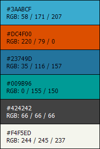
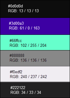
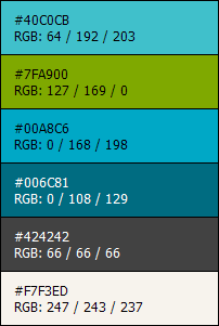
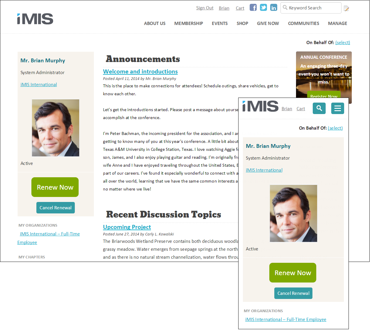
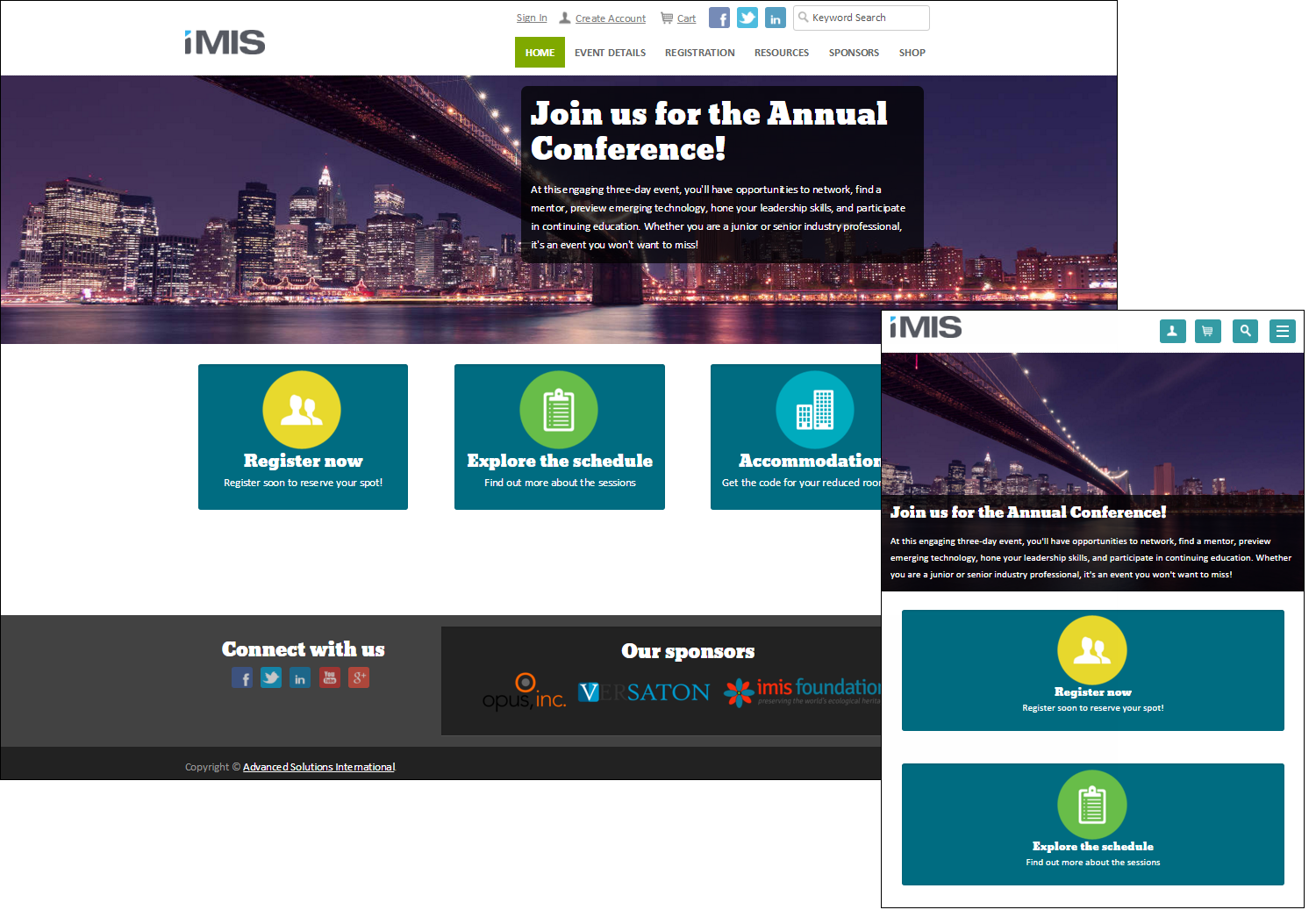
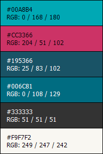
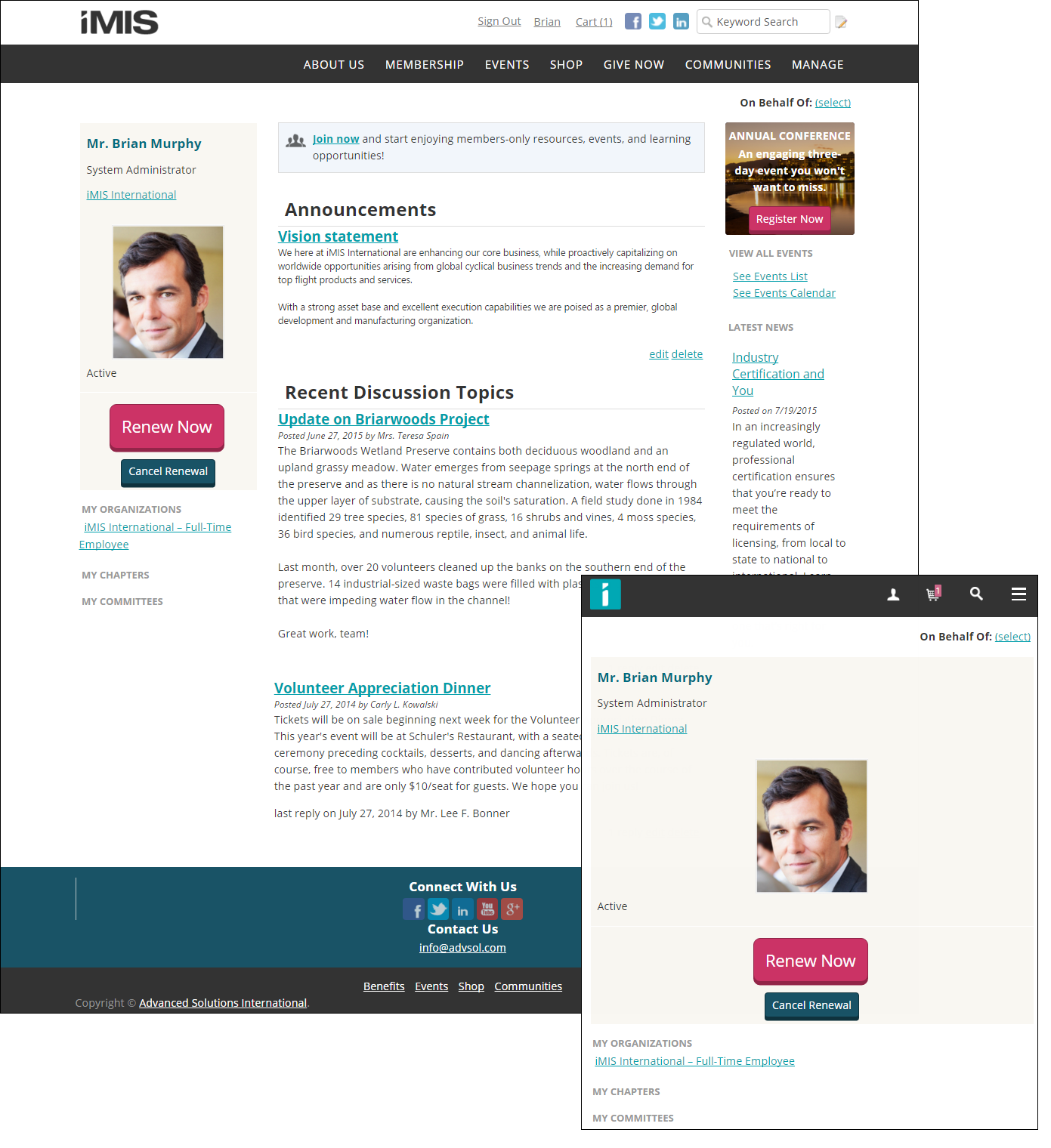
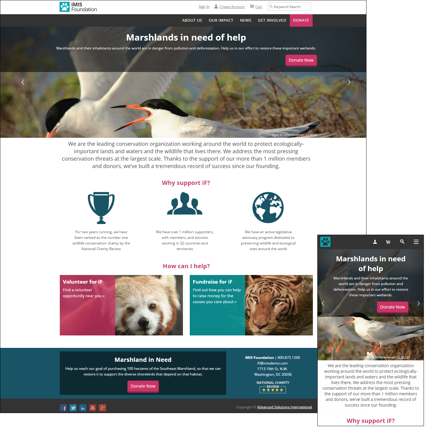
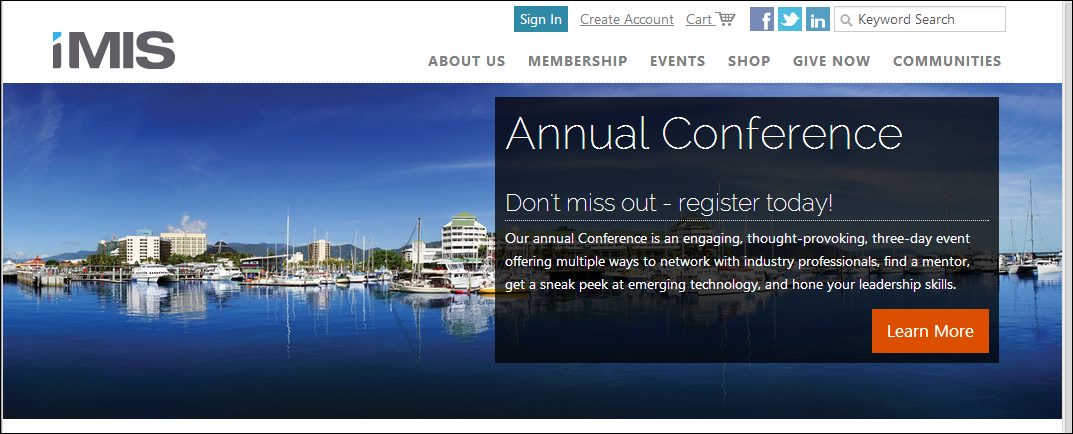
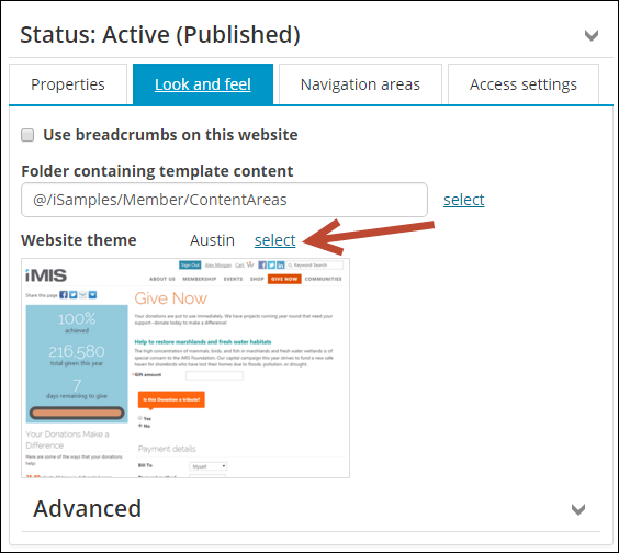
You can change the look and feel of the Quick Start Sites by selecting a different Website theme. Each out-of-the-box website theme is automatically paired with a website template. Selecting a new out-of-the-box theme automatically selects the correct correlating template. If you want to modify a particular design for your website, make sure you create a copy of the Website theme before making any changes. For more information, see Managing websites.
Note: iMIS themes give you a head start on developing your website. To provide you an idea of how things could look, we have used numerous pictures, illustrations, and images that we purchased under a limited license for ASI's use. The icons can be used on your website, but if you reuse any of the other images, you will need to buy a license. We acquire the majority of our images from iStockPhoto and most are available in the range of $15-$50, which is much less than the cost and labor of creating them on your own. If you have any questions, please contact us.
Warning!
If possible, avoid customization to out-of-the-box website themes and templates. If you do need to make changes, make the changes in a copy of the theme or template. Any customizations performed to the out-of-the-box files will be overwritten after an upgrade.
These website themes were created specifically for staff site functionality, and should not be used with member-facing websites:
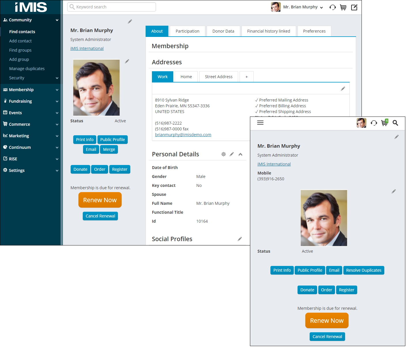
Orion is the website theme applied to your out-of-the-box Staff site. Although Orion is a responsive Staff site theme, RiSE, Continuum, and Manage communication templates were not designed to be responsive on mobile devices. The template used with this website theme is Constellations.
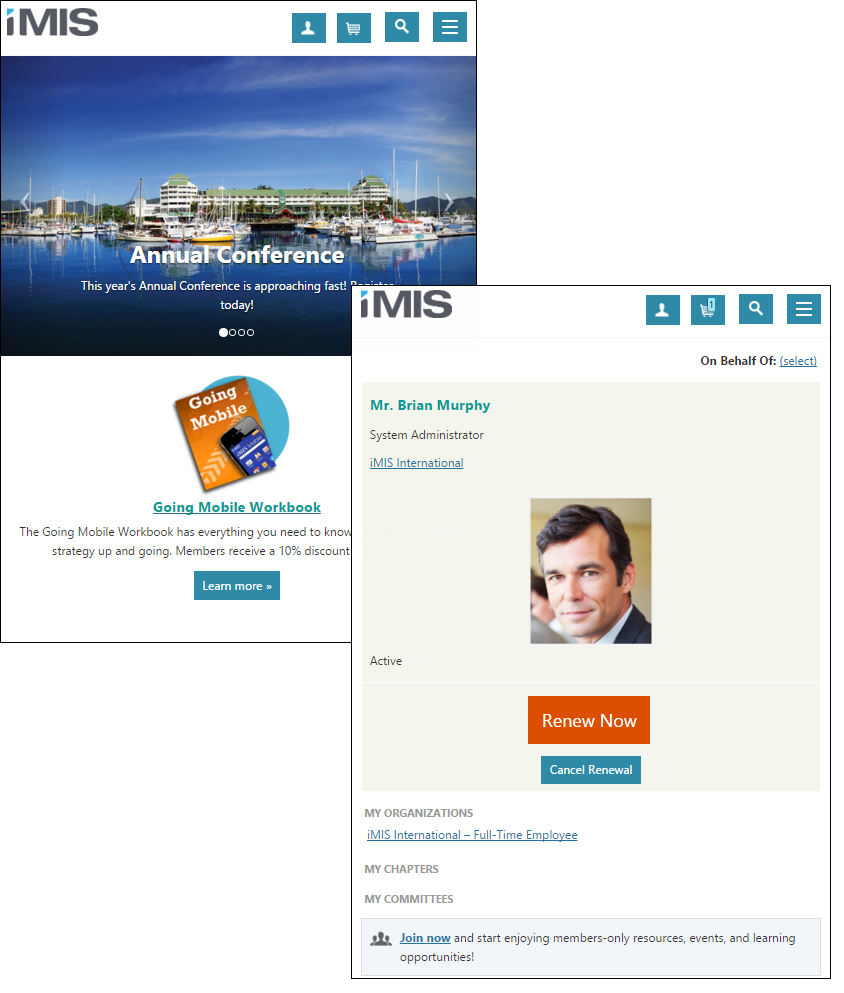
The following themes were designed to be implemented on public-facing sites. For example, a member or donor site. The responsive themes were built to work best with responsive websites, such as the Member Responsive Quick Start Site. The themes without Responsive in the title were not built to be responsive.
Responsive themes
Similar to the look and feel of the Austin theme, Austin Responsive is visually appealing on mobile, and other hand-held devices. This website theme uses the Cities Responsive template.
This theme home page looks the same whether a member is logged in or not. The template used with this theme is Sapling.
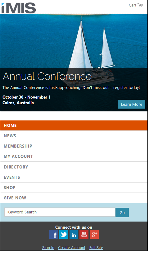
This website uses the WST - Natural Heritage Sites Responsive template.
Note: Themes marked with WST (website theme) indicate that the theme is RiSE-built, and can be edited in iMIS. See Creating RiSE-built website templates for more information.
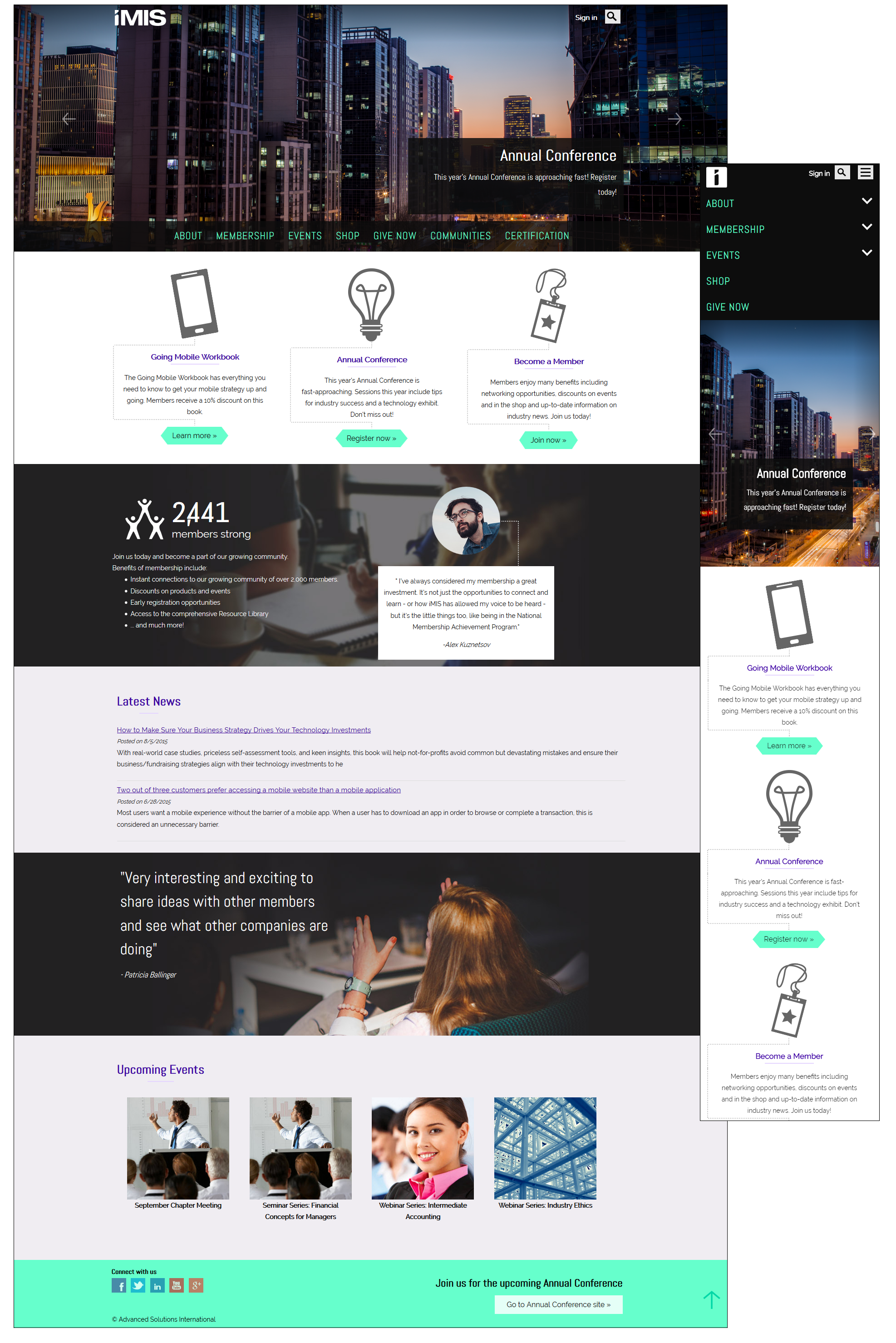
Non-responsive
Although not a responsive theme, this Austin theme has a responsive counterpart, Austin Responsive. This website theme uses the Cities template.
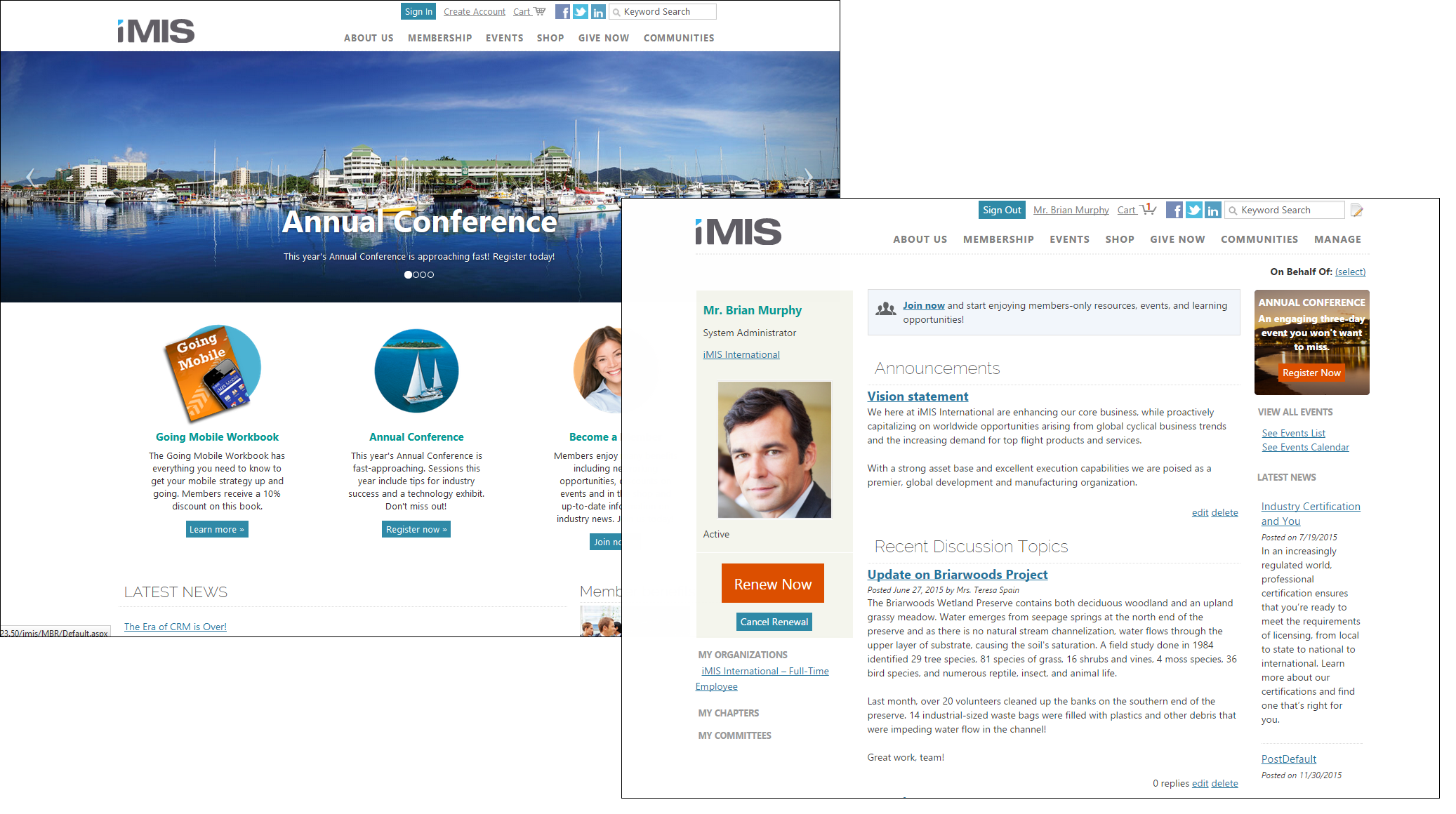
Note: The Great Barrier Reef Responsive theme is built using content items located in RiSE, therefore does not follow the below conventions. See Creating RiSE-built website templates and Website gallery for more information.
iMIS Member and Donor sites include a style guide that allows users with administrative privileges to see the impact of changes to site themes from one central location. Content editors are able to preview their site themes and changes. Theme designers who choose to dive deeper into stylesheets are able to see their work in a single central location. There is no longer a need to navigate to several different pages or content records to see the effects of customization.
The style guide displays the basic HTML elements in an attractive, easy to navigate manner. Content includes headings, paragraphs, links, images, lists, block quotes, user messages, and emphasis classes. This helpful guide is available at Manage > Style Guide > Base Elements.
Several themes have been created for the Quick Start Sites. You can modify these themes to help identify and personalize your organization’s website.
- Never change the core style sheets 00-Reset.css and 10-UltraWave.css. All derivative themes inherit from these files, and any changes you make to them are lost on upgrade. Instead, override the base styles in your 99-[theme].css.
- Before modifying a theme, find the best one: apply all of the themes to the default Member site in turn, and decide which theme is closest to the final look and layout that you want.
- Always work from your copy of the theme, so that you can begin again. For more information, see Copying a website theme.
- Make changes only to websites that you create. When a Quick Start Site is updated with each release, the iMIS Upgrader overwrites any changes you made to it.
- Take advantage of browser-based developer tools to test and troubleshoot changes before committing them to your style sheets:
Press F12 to toggle the Developer Toolbar.

Install the Firebug add-on to see a wealth of information about the structure of the website and the styles it is using. Turn on the element inspector and click a piece of content to see the styling that it is implementing.

The first elements to change on your website are the highly visible elements that public visitors see and use in the header: logo, social networking links, welcome banner, and the favicon.
The header logo is contained in a content record: @\[theme]\ContentAreas\Header Logo. To add your own logo, edit this content record, remove the contents in the HTML Content Item, and replace with your own logo.
Note: Alternatively, you can change the logo in the CSS. The logo is set in 99-[theme].css by the selector #masterHeaderImage. Change the background image and the dimensions to match your own logo.
The dimensions in pixels for the out-of-the-box themes are as follows:
- Aspen:
- HeaderLogo - 511 x 55
- HomeBanner - 1400 x 359
- Aspen2:
- HeaderLogo - 491 x 55
- HomeBanner - 1400 x 359
- Birch:
- HeaderBackground - 1400 x 150
- HeaderLogo - 482 x 55
- HomeBanner - 1400 x 424
- Great Barrier Reef_responsive
- HeaderLogo - 120 x 46
- Mercury:
- HeaderLogo - 471 x 59
- HomeBanner - 1003 x 320
- Venus:
- HeaderLogo - 458 x 56
- HomeBanner - 1003 x 320
- Mars:
- HeaderLogo - 482 x 55
- Austin, Austin_Mobile, Austin_Responsive, London_Responsive:
- HeaderLogo - 122 x 38
- Toronto_Responsive:
- HeaderLogo - 168 x 46
- Aspen_Mobile:
- HeaderLogo - 100 x 38
- Everest, Orion - Changing the logo on these themes is currently not supported.
The HomeBanner will resize to fit the space, but the width should be at least 1000 px. If you are using the Slideshow content item, the height should be the same as the Height (px) configured in the content item.
The links to the social networking sites in the top (auxiliary) navigation are also defined in a content record: @\[theme]\ContentAreas\Social Networking Images.
To change the links to navigate to your own social networking pages, edit the content record and change the links on the icons.
In the HTML editor, replace the href on each <a> tag with the appropriate URL.
Example: <a href="http://www.facebook.com/geointernational" target="_new"> <img id="FacebookLogo" style="border-width: 0px;" alt="Visit our Facebook page" src="[Theme]/images/facebook.png" /> </a>
The copyright statement is contained in a content record within your copied site’s ContentAreas folder: Footer Copyright. Edit the Footer Copyright instance of the Content Html content item on that page to update the copyright.
The Member and Member Responsive sites uses a pair of home pages: one that appears to guests (unauthenticated view) and another that appears to those who have signed in (authenticated view). You can change one or both of them, or drop one entirely and have one home page appear to all.
- Go to RiSE > Page Builder > Manage content.
- Create a new content record for your unauthenticated and authenticated home pages:
- (Properties tab) Select the option User is authenticated or User is not authenticated for the Conditions for redirect.
- (Properties tab) Define a Target URL or shortcut for redirect. The target may contain either a:
- Full URL beginning with http:// or https://
- Shortcut such as ~/MyShortcut
- Content path supplied by using the select link to navigate to a piece of content
- Save and Publish your home page.
- Make your site’s home page link to your new home page.
- Go to Site Builder > Manage sitemaps.
- Select your website.
- Edit the default navigation item (flagged with a golden star) and select your new home page for Content or URL to Link to.
- Save and Publish your sitemap.
iMIS provides various templates that help control the layout of a website. The Cities and Cities_Responsive templates include a home page area with a banner stretched across the width of the home page.
If you are using the Cities or Cities_Responsive template, you can copy and modify the Home Page Full Width Area content record to include your organization's unique image and content.
The Member website is used as an example in these instructions.
Do the following to add a banner to your home page:
- From the Staff site, go to RiSE > Page Builder > Manage content.
- Copy or modify the Home Page Width Area content record. Do one of the following:
- Copy the content record located at @/iSamples/Member/ContentAreas/Home_Page_Full_Width_Area, and paste the content record to your website's Content Areas folder.
- Locate the Home Page Full Width Area content record if you using an iMIS-copied Quick Start Site (@/website/ ContentAreas/Home_Page_Full_Width_Area).
- Select the content record and click Edit.
- Select Configure on the Slideshow content item.
- Make the desired changes. For more information about the Slideshow content item, see Slideshow.
- Click Save & Publish. Publishing time may vary depending on the number of slides in the content item.
Note: Choose an image that looks great at very wide resolutions, as the image will always stretch the full width of the browser. For best results, use landscape-sized images 1000-1400 pixels wide.
iMIS sites use various styling elements to create visually appealing websites, a part of this process includes using background images. Background images can be changed by using inline styling on the div that correlates to the area that contains the background image.
For example, in the Donor sample site there is content on the home page with animal pictures in the background. You could change the picture to something you choose by applying a background-image style to the div:
Example: <a href="[website]Get_Involved_/Volunteer/iSamples/Donor/Get_Involved_/Volunteer.aspx" class="feature-link-with-image feature-link-1" style=”background-image:url(http://www.mywebsite.com/images/my-background-image.jpg)”/></a>
Tip: Choose an image that looks great at very wide resolutions, as the image will always stretch the full width of the browser. For best results, use landscape-sized images 1000-1400 pixels wide.
There are also background images on the homepage of the Member Responsive site when using the GreatBarrierReef_Responsive theme. To edit these images:
- Navigate to RiSE > Page Builder > Manage layouts.
- Make a copy of the Three33-33-33OverOne-FullWidth layout and open your copy.
- In the Code tab in the Layout code window, change the background image using inline styling on the FullWidthArea div you would like to change, as in the following:
- Click Save.
Example: <div class=”FullWidthArea-StyleBg2” style="background-image:url(http://www.mywebsite.com/images/my-background-image.jpg)”/>
The Quick Start Site themes and templates (see Using Quick Start Sites) build upon a new underlying template called UltraWave. UltraWave incorporates structure and styling for Universal Design. Universal Design seeks to make web content barrier-free, making sites accessible to all challenged users. Challenged users include not only the millions of physically or cognitively impaired, but also seniors, non-native speakers, and those in other countries and cultures (localization).
Universal Design has benefits beyond helping websites meet the myriad of web accessibility standards: it also aids in breaking technology and human barriers. Universal Design is the foundation for transforming pages and content into outputs and displays your members may need, including print presentation, net book usage, and even cell phone applications.
Features of the template include:
- Developed toward W3C standards to help meet accessibility requirements
- Clean, minimal design uses neutral shades and layout
- Offers a streamlined set of stylesheets and skins
- Easily customized with logos, fonts, and colors
- Designed to be easily rebranded by your organization
