Last updated on: June 19, 2026
QuickStart Template
Widgets
Widgets are tools that can be used to enhance the presentation of information on your website. The following widgets are used in the QuickStart Template:
Flip cards
A flip card is a page element that flips to reveal additional content when the user hovers over it (or taps on a mobile). This effect mimics the flipping of a physical card, providing a visually engaging way to display more information without taking up extra space on the page.

These cards can be configured to include different color options, different shapes, and can link to a URL.
Creating a flip card
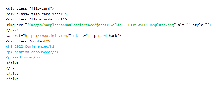
Flip cards need to be updated the HTML to ensure the structure is maintained.
Important! The image size should be 300px x 300px when in a 33% (or larger) column or 250px x 250px when in a 25% column.
Do the following to create a flip card:
- Go to RiSE > Page Builder > Manage content.
- Navigate through the following folder path: @/Web/QuickStart/Widgets/Flip cards
- Scroll down and locate the flip card with the format you would like to use.
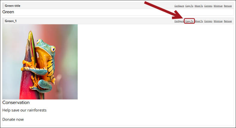
- Select Copy To on the content item.
- Navigate to and select the content page the flip card will be included on.
- Click OK.
- Go to the page where the copied content item is included.
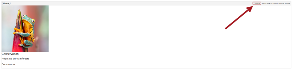
- Select Configure on the copied content item.
- Click HTML to open the HTML configuration page.
- Make any necessary changes:
- Update the source URL to change the image.
- Update the link HREF to change the link destination.
- Update the text inside the 'content' div to change the text.
- Click OK, then click Save & Publish.

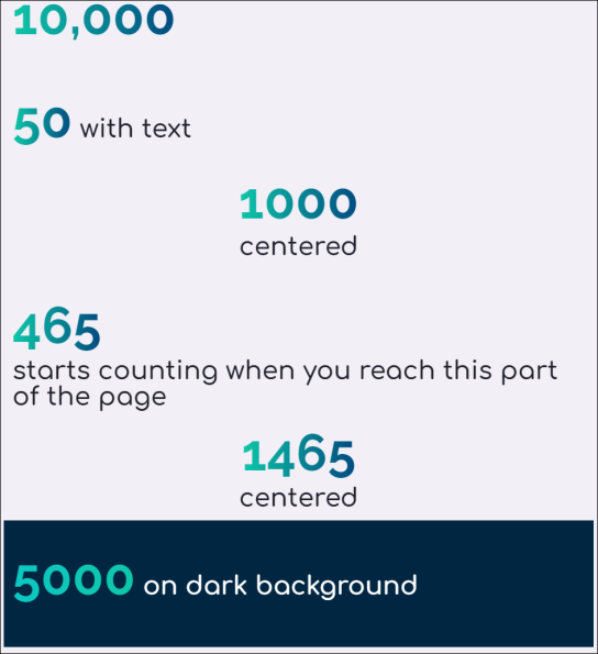
Large numbers
Large numeric values can be generated and displayed on the website to convey key metrics with strong visual impact. The class big-num on an HTML content item to create large numbers. Any text or numbers inside a heading will take on the gradient and large format. Other text in the content item will be larger than standard body text.
Configuring large numbers
Do the following to create or configure copied large numbers:
- Go to RiSE > Page Builder > Manage content.
- Navigate through the following folder path: @/Web/QuickStart/Widgets/
- Double-click the Large Numbers content record.
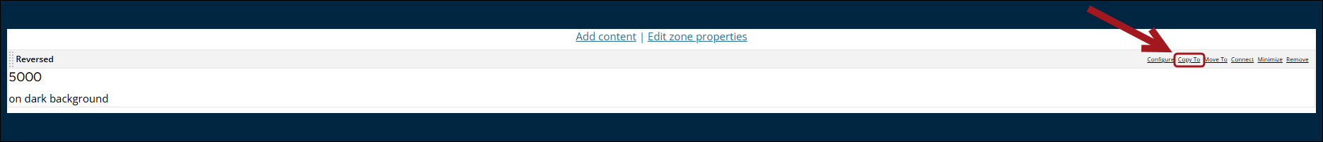
- Select Copy To from the desired content item.
- Navigate to and select the content page the flip card will be included on.
- Close the content record.
- Navigate to and double-click the content record that the content was copied to.
- Click OK.
- Select Configure on the copied content item.
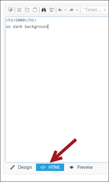
- Click HTML to open the HTML configuration page.
- Make any necessary changes:
- Add center to center the text in the content item.
- Add white if the text is on a dark background and it will use different colors for visibility.
- Copy both the Counter and Counter JS content items from the Large numbers content record (@/Web/QuickStart/Widgets/Large numbers) to use the animated counter. The animated number must be changed in the HTML view in the Counter content items. Update the data-count value.
Note: Place the Counter JS content item in the website template if it will be used across several pages of the site. Otherwise it should be on the same page as the Counter content item, beneath it.
- Click OK, then click Save & Publish.

Tagged list formats
Tagged list formats are used by Content Tagged List content items to format the rendered display of the list of links. The chosen tagged list format is applied as a display mask to each item in the list. For example, one tagged list format might display only a simple list of links, while another tagged list format might display a link followed by the HTML contained in any ContentHtml content items in the target content record.
Using Tagged list formats
Go to RiSE > Page Builder > Manage content, and navigate to @/Web/QuickStart/Widgets/New Tagged List Formats to view examples of the formats:
- FourAcross
- FourAcross_simple
- ThreeAcross
- ThreeAcross_simple
Note: There are also versions of each format with the affix AUSUK which displays the Publish Date in d/m/yyyy format.
To use these formats, do the following:
- Add the Content Tagged List content item to the desired content record.
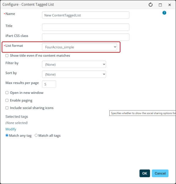
- From the List format drop-down, select the desire format.
- Click OK, then Save & Publish.
Additional notes
- The News Image JS custom content item is required to resize images correctly. Copy it from @/Web/QuickStart/Widgets/New Tagged List Formats. Place the News Image JS custom content item in your website template if it will be used across several pages of the site. Otherwise it should be on the same page as the Content Tagged List content item, directly beneath it.
- Replace the default image that shows when there is no image assigned to a content page by replacing the image named no-image.png in the images folder.
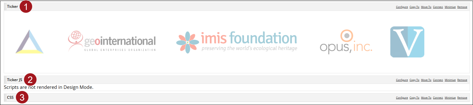
Scrolling logos
The Scrolling Logos widget can be utilized to create a scrolling ticker of images, most often used for sponsor logos. The animation begins when a user scrolls to the section of the page the ticker is on.

Important! This widget requires JavaScript the content item Ticker JS, which is included in the Quickstart_CitiesResponsive, Quickstart_Coffee and Quickstart_NaturalHeritageSitesResponsive website templates, and the CSS content item. If you are using a different website template, make sure this is included either on the page or in your own website template.
Do the following to create a scrolling logo:
- Go to RiSE > Page Builder > Manage content.
- Navigate through the following folder path: @/Web/QuickStart/Widgets/
- Double-click the Scrolling Logos content record.
- Copy the Ticker, Ticker JS, and CSS content items to the desired content record. Make sure the content items are arranged in the following order:
- Ticker
- Ticker JS
- CSS
Configuration options and tips
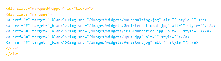
- Add, remove, or edit a logo by editing the Ticker content item in the HTML view.
- The recommended image size is 100px tall and not more than 250px wide.
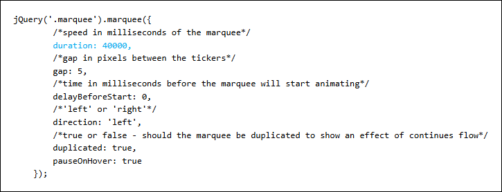
- To change the speed of the scrolling, edit the duration in the JavaScript file.
Note: Edit in HTML view so as to not accidentally delete or alter the wrapper divs shown below in orange. Edit the linked images shown in blue - add or delete links and update the links and images.
Note: The whole logo will show at once on mobile devices. If the logo is too wide, it may appear cut off as it moves across the screen.
Zooming images
The zooming image widgets allow you to link images that zoom in on hover to give users a closer view. The images fill the available width of the content zone they are placed in, and staff may set the height using the provided CSS classes.
The following zooming images are available:
- Different Heights
- Zoom full-200
- Zoom full-300
- Zoom hover full-400
- Zoom hover full-500
- Zoom hover full-600
- Different Widths
- Zoom split2-1
- Zoom split2-2
- Zoom split3-1
- Zoom split3-2
- Zoom split3-3
- Text Below
- Zoom text1
- Zoom text2
- Zoomtext3
- Text Overlay
- Overlay1
- Overlay2
- Overlay3
- Rounded corners
- Zoom round2
- Zoom round_1
Creating and configuring zooming images
To create a zooming image, do the following:
- Go to RiSE > Page Builder > Manage content.
- Navigate through the following folder path: @/Web/QuickStart/Widgets/
- Double-click the Zooming images content record.
- Select Copy To from the desired content item.
- Navigate to and select the content page the zooming image will be included on.
- Click OK.
- Select Configure on the copied content item.
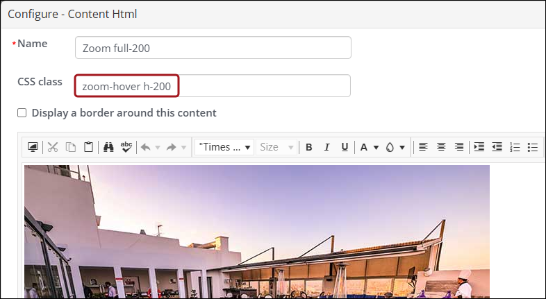
- In the CSS class field, add "zoom-hover" and the height in pixels. For example, "zoom-hover h-200".
- From the HTML tab, make sure to update the img src link to display the desired image.
- Click OK, and then click Save & Publish.