Last updated on: June 19, 2026
The Secondary Navigation content item is used to display the secondary navigation of the website. This is usually displayed on the left or right side of the page. The secondary navigation content is displayed only if the selected page has secondary navigation content associated with it.
For the Secondary Navigation content item, you also must specify the Starting at level. The selected level introduces the secondary navigation, and will not be displayed if the selected page does not contain that level of navigation. After the Starting at level is defined, you must choose a Display level. This level determines the depth of the secondary navigation.
Review the following before using the Secondary Navigation content item:
- In order to use the Secondary Navigation content item properly, you will need to know the name of the theme Skin to use with it. See Copying a website theme for more information.
- The Secondary Navigation content item is required for all website templates to ensure community notifications are properly sent. See Creating RiSE-built website templates for more information.
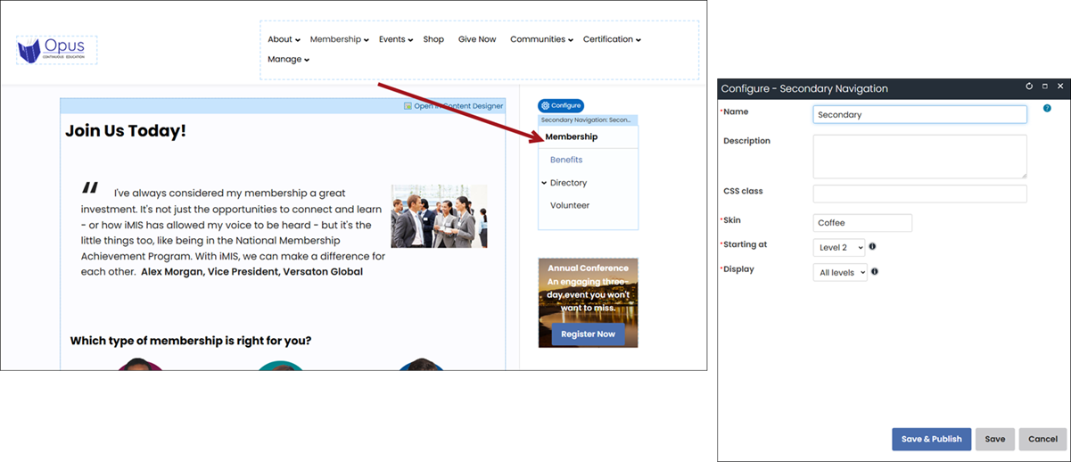
Secondary Navigation configuration options
- Name - Enter a name for the content item. This text appears during design mode (configuration).
- Description - Enter a description to display above this content item on the rendered page. The maximum length is 5000 characters. If blank, no description displays. This field supports HTML and relative file paths using the following variables:
- [Website] and [@] – Both variables resolve to the root of the website and contain the website name. For example, [Website]Home.aspx resolves to http://example/Staff/Home.aspx.
- [~] and [Root] – Both variables resolve to the root of the website. For example, [~]Home.aspx resolves to http://example/Home.aspx.
- [Common] – Resolves to the AsiCommon directory of the website. For example, [Common]images/image.png resolves to http://example/AsiCommon/images/image.png.
- [iMIS] – Resolves to the iMIS directory of the website. For example, [iMIS]images/image.png resolves to http://example/iMIS/images/image.png.
- [Theme] – Resolves to the website’s theme folder. For example, [Theme]images/image.png might resolve to http://example/App_Themes/Orion/images/image.png. This variable can be used to access theme resources such as images and CSS.
- CSS class (optional) - Enter the name of a CSS class to associate with this content item, which will add a DIV so named around the content item. Add this CSS class to an appropriate style sheet. Using such classes lets you apply special formatting to targeted content items in a reusable way.
- Skin - Enter the name of the custom skin that will be applied to the secondary navigation.
- Starting at - The selected level introduces the secondary navigation. If a selected page does not contain this level of navigation, the secondary navigation will not be displayed.
- Display - After the Starting at level is defined, select the depth of levels to be displayed in the secondary navigation.
The Hide secondary navigation setting (located on the Property tab of each content record) is ignored when you are using a Theme Builder template (RiSE > Theme Builder > Website templates) and have the Secondary Navigation content item’s Starting at option set to Level 1.
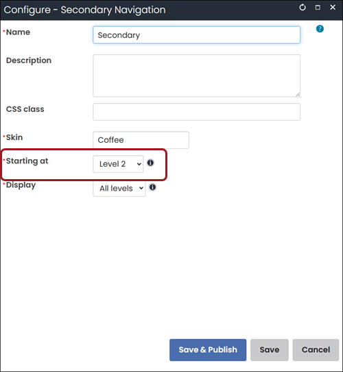
Setting the Starting at option to Level 1 specifies that the secondary navigation is globally applied to the website and is never hidden. The Starting at option should be set to Level 2 if you do not want the Hide secondary navigation option to be ignored.