Last updated on: April 23, 2026
Place the Primary Navigation content item where you want the primary navigation of the website to be displayed. In order to use this content item properly, you will need to know the name of the theme Skin to use with it. See Copying a website theme for more information.
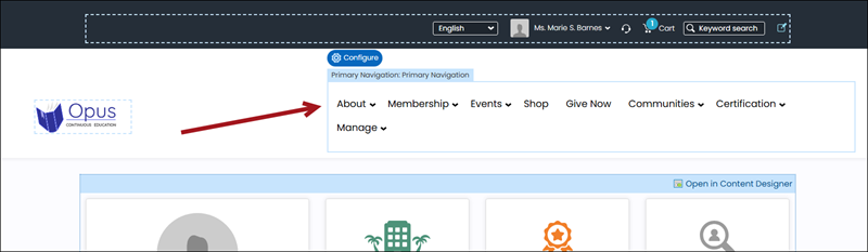
Primary Navigation configuration options
- Name - Enter a name for the content item. This text appears during design mode (configuration).
- Description - Enter a description to display above this content item on the rendered page. The maximum length is 5000 characters. If blank, no description displays. This field supports HTML and relative file paths using the following variables:
- [Website] and [@] – Both variables resolve to the root of the website and contain the website name. For example, [Website]Home.aspx resolves to http://example/Staff/Home.aspx.
- [~] and [Root] – Both variables resolve to the root of the website. For example, [~]Home.aspx resolves to http://example/Home.aspx.
- [Common] – Resolves to the AsiCommon directory of the website. For example, [Common]images/image.png resolves to http://example/AsiCommon/images/image.png.
- [iMIS] – Resolves to the iMIS directory of the website. For example, [iMIS]images/image.png resolves to http://example/iMIS/images/image.png.
- [Theme] – Resolves to the website’s theme folder. For example, [Theme]images/image.png might resolve to http://example/App_Themes/Orion/images/image.png. This variable can be used to access theme resources such as images and CSS.
- Limit the navigation levels to display - The navigation bar automatically populates with each top-level navigation item. Each sub-navigation item displays in a drop-down list that expands into multiple levels, depending on how many sub-navigation items are defined. Select this option if you do not want all sub-navigation levels to display, or leave it unselected to display all navigation levels.
- Number of navigation levels to display - Enter the number of navigation levels that you do want displayed.
- Enable the mega drop down menu - Mega drop-downs display navigation items within large panels, grouped by level, which reduces scrolling, and improves the usability of site navigation. Select this option if you want the primary navigation displayed as a mega-menu.
- Enable expand delay - Select this option to enable menu-expansion delay when hovering over the navigation.
- Enable collapse delay - Select this option to enable menu-collapse delay when no longer hovering over the navigation.
- Skin - Enter the name of the custom skin that will be applied to the primary navigation.
Note: If Enable the mega drop down menu is enabled, then a value of 1 causes all of the navigation levels to be displayed.