Last updated on: June 19, 2026
Place the Query Chart Viewer content item on any content records to display query results in a chart. The chart can be set to a range of sizes, skins, and chart types. This content item can be seen on any of the out-of-the-box Staff site Dashboards.
In This Article

Designing queries for Query Chart Viewer
The Query Chart Viewer content item can render any existing query, but you will find the best results by following these guidelines on how to design queries specifically for use with this content item:
- Queries – The queries you create for the content item should be structured so that the results are appropriate for charting. For example, if you want the chart to display the total sales per salesperson, then the source query should be written using the Sum function in IQA.
- Query Display Columns – Each property you select on the Display tab in IQA is available in the configuration page as a Data column display option. You can select up to three properties to be displayed on the Query Chart Viewer content item if you want to display a chart with multiple data values.
- Aliases – In your source query, enter an Alias for the Display properties you plan to show in the content item. Relying on the default labels might not be sufficient, especially when your query uses multiple joined sources or custom SQL expressions. If the query is not displayed as you expect, using an Alias often resolves the issue.
- Sorting – You can sort the query results displayed in your chart in Ascending or Descending order. To sort your results, edit your source query and, from the Sorting tab, add the property to be sorted.
- Labels – The labels on your chart’s x-axis might overlap if there are too many data points or if the labels are too long. You might be able to improve the display through a few methods: In the content item, you can expand the width of the chart or change the label angle. In the query, you can try to reduce the number of data points.
Note: In order to display multiple data values in a chart, a property in the Display tab must have the checkbox checked in the Group By column. The properties for which the checkbox is selected in the Group By column will be available as options for the Series data column configuration option in the content item. Do not use the Group By option to display query results in a hierarchical grid of summary rows and detail rows.
Query Chart Viewer configuration options
This content item uses the Common content item configuration options, in addition to the following:
- Name - Enter a name for the content item. This text appears during design mode (configuration).
- Title - Enter the text to display above this content item on the rendered page. If blank, no title is displayed.
- Do not render in design mode - Select this option to prevent content record data from being loaded in the content editor. This improves performance during design time (configuration).
- Display a border around this content - Select this option to display a border around this content item on the rendered page.
- Limit users who can view data for other contacts - (enabled by default)If this option is enabled, only authorized users can view information for contacts other than themselves. This prevents other users from changing the ID in the URL to access another contact's data. Authorized users include staff and Company Administrators for a group that the contact belongs to. Disable this option to allow all users to view information for other contacts, such as for a public profile. If this option is disabled, the system security settings determine whether a user must be logged in to view information for other contacts.
- Chart data - Use the following options to configure the type of chart data to display:
- Source query - Click select and browse to the IQA query for which you want to see results in the chart. Note that depending on the type of chart displayed, the performance of the content item can be affected by how the query is sorted. The query for a pie chart, for example, should be sorted by the data column.
- Series data column - Choose the query column to use for multiple values of data.
- Series data format - Choose the query column to use multiple values of data labels.
- Data axis - Choose the query column to use for data values. For a pie chart, this will determine the sections of the pie, and for other charts this will be the Y axis.
- Data axis format - Choose the format for the data in the data column.
- Label axis column - Choose the query column to use for data labels. For a pie chart, these labels will be displayed next to the corresponding section, and for other charts this will be the X axis.
- Label axis format - Choose the format for the labels in the label column.
- Hide chart when no data is found - Select this option to hide the chart when no data results are returned.
- No data text - Enter the text to display when no data results are returned.
- Display options - Use the following options to configure how the chart data will be displayed:
- Title - If you want a title to be displayed within the chart, enter the text for the title here.
- Type (required) - Choose the type of chart to display.
- Enable stacked series - Enable this option to display related data stacked on the same data-point bar. This option is only available for Bar - Horizontal and Bar - Vertical display types.
- Interpolate missing values – Enable this option to estimate the unknown value in the same increasing or decreasing order from the previous data point, such as event registrations over time. This option is only available for Area and Line display types.
- Skin - Choose a skin to determine the color scheme and appearance of the chart.
- Width (required) - Enter the width of the chart in pixels.
- Height (required) - Enter the height of the chart in pixels.
-
Enable option to view query results in a grid - Enable to allow users to switch between a chart view and grid view by clicking the grid icon in the upper-right of the chart. This option is disabled by default.
- Labels - Use the following options to configure the type of chart data to display:
- Legend label - If you want a series label to appear on the chart, enter the text for the label here.
- Legend position (required) - Select where to display the series label for the chart:
- Hidden
- Top
- Bottom
- Left
- Right
- Display axis labels - Select this option to enable displaying a chart series label.
- Axis label angle - Enter the degree of rotation for the labels on the chart. For example, a value of 45 will display the labels at a 45-degree angle.
- Enable tooltips - Select this option to enable tooltips in the chart.
Note: This option is only displayed when the source IQA query has a Group By option checked in the Display tab, and the selected display Type is one of the following: Area, Line, Bar - Horizontal, Bar - Vertical. Do not use the Group By option to display query results in a hierarchical grid of summary rows and detail rows.
Note: This option is only displayed when the source IQA query has a Group By option checked in the Display tab, and the selected display Type is one of the following: Area, Line, Bar - Horizontal, Bar - Vertical
Note: Each property you select on the Display tab of your query in IQA is available as a data column display option.
Note: (Area, Line, and Bar charts only) If the Label axis format has Day, Day Name Short, or Day Name selected and the number of days exceeds 45, then the label automatically changes to the correlating month option. If the Label axis format has Month, Month Name Short, or Month Name selected and the number of months exceeds 48, then the label automatically changes to the correlating year option.
Note: Width and Height can be set to 0. If set to 0, then 100% is implied. This applies to all chart types except the Sparkline variation of a chart.
Note: You cannot add a series label for Pie or Donut chart types.
Chart types
The following are examples of chart types in the Query Chart Viewer content item.
Note: Sparkline charts are not responsive.
Area
Displays data in an area filled with color to illustrate trends.
Enable the Interpolate missing values option on the Query Chart Viewer content item to insert points between known values on the graph, for example, a chart that details registrations over time.
Note: You can display multiple data values in an Area chart.
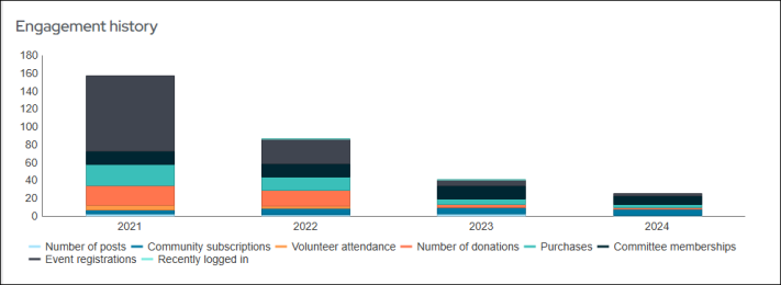
Bar - Horizontal
Displays sets of data with horizontal rectangular bars for comparison.
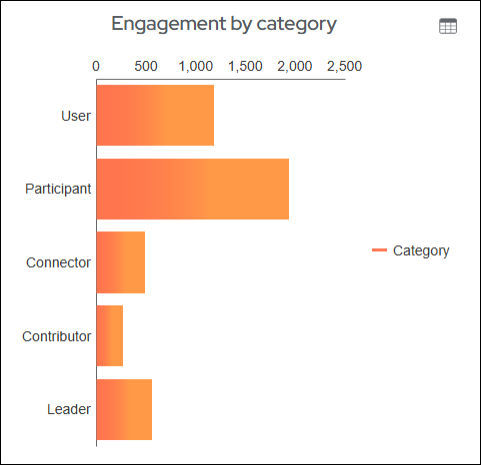
Note: You can display multiple data values in a Bar - Horizontal chart.
You can also select Enable stacked series. This option allows related data to be stacked on the same data-point bar. It can be enabled when Group By is selected in the source IQA. This option is only available for Bar - Horizontal and Bar – Vertical charts.
Bar - Vertical
Displays sets of data with vertical rectangular bars for comparison.
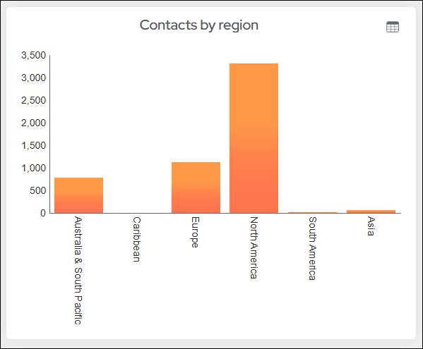
You can display multiple data values in a Bar - Vertical chart.
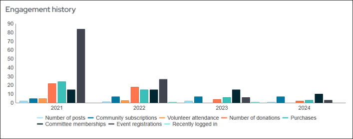
You can also select Enable stacked series. This option allows related data to be stacked on the same data-point bar. This option is only available for Bar - Horizontal and Bar – Vertical charts.
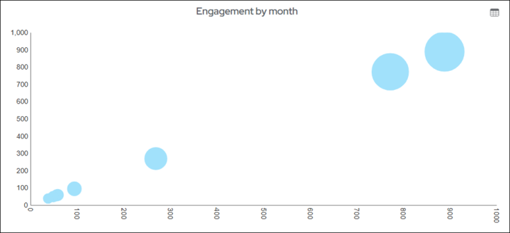
Bubble
Displays data as a series of bubbles. You cannot assign a size value to the bubbles in the Bubble chart.
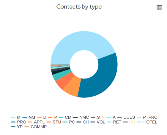
Donut
Functionally identical to a pie chart, with the exception of a blank center and the ability to support multiple statistics at once.
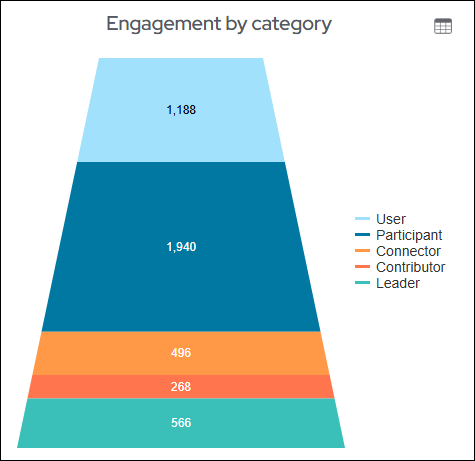
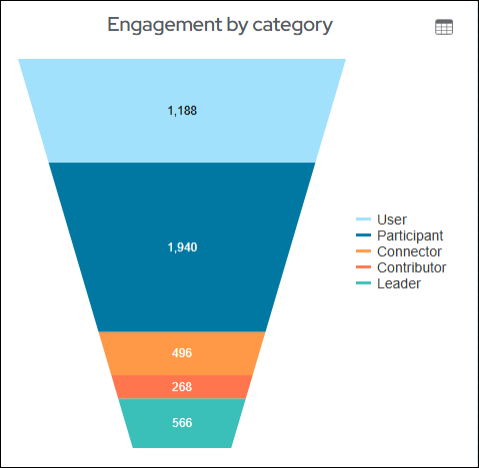
Funnel
Displays data in descending order to create a top-down funnel. Adjust the width and height to change the size of the chart.
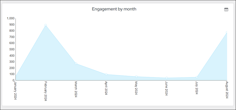
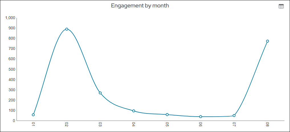
Line
Displays data as a series of data points connected by a line to illustrate trends. For example, create a line chart that shows the number of contacts in your organization by customer type.
Enable the Interpolate missing values option on the Query Chart Viewer content item to insert points between known values on the graph, for example, a chart that details registrations over time.
Note: If the chart is not showing all of the data points, try removing the time portion for date time values or reducing the number of rows returned in the source query.
Note: You can display multiple data values in a Line chart.
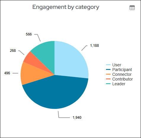
Pie
Displays data in a circular chart divided into sections to illustrate proportion.
Pyramid
Displays data in ascending order to form a pyramid shape. Adjust the width and height to change the size of the chart.