Last updated on: June 19, 2026
The Big Button Panel content item enables displaying a navigation panel that combines a larger, category-defining image with a list of links.
You can also use this content item to create links that make it easy for staff to perform routine tasks for contacts such as running reports, registering for events, and ordering on their behalf.
Big Button Panel configuration options
This content item uses the Common content item configuration options, in addition to the following:
- Limit users who can view data for other contacts - (enabled by default) Select this option to hide the content item if the user viewing the page does not have access to edit the selected content.
- Panel image - (optional) Enter the URL to an image to display within the panel. The URL can be absolute (http://example.com/<myImage>.jpg) or relative (~/images/<myImage>.jpg).
- Image alt text - (optional) If a Panel image is selected, enter a description for the image to be used as the alternative text.
- Mode - Select a mode for the Big Button Panel:
- Navigation - Select this mode if you only want to offer a list of links. The options to filter by a URL Parameter and to trigger working On behalf of (OBO) someone are not available in Navigation mode.
- Navigation item - (only available in Navigation mode) Select a navigation item for content to display within the panel:
- Include parent navigation item - Select this option to include the parent navigation item as a link.
- Child levels to display - If the navigation item selected has child navigation items within the sitemap, enter the number of levels to display. If you enter 0, all descendants are displayed. If you enter 1 or more, only that number of navigation levels is displayed.
- Navigation item - (only available in Navigation mode) Select a navigation item for content to display within the panel:
- Actions - In this mode, links can also contain URL Parameters that use dynamic filters. For example, you can pass the ID for the selected contact to the target page, which you can then use in content items, or to run reports for the contact. An additional option is also available to trigger working On behalf of someone.
- Navigation - Select this mode if you only want to offer a list of links. The options to filter by a URL Parameter and to trigger working On behalf of (OBO) someone are not available in Navigation mode.
- Display as - Choose how links should be displayed:
- Links - Displayed as linked text.
- Buttons - Displayed as buttons, using the out-of-the-box button styling (TextButton). Enter a custom CSS class in the CSS class field to change the styling of the button.
- Dropdown button - Displayed as a drop-down button with links to the Additional links/Actions.
- Dropdown button text - The text displayed in the drop-down button. The default text is Actions.
Note: Use the account-page-top-area CSS class to blend the content item background into the theme’s background color and to reduce padding with the Contact Mini Profile banner display styles.
- Open links in a pop-up - Select this option to open links selected within the Big Button Panel in a pop-up window. This option is useful, for example, if you want to quickly run a report or view information about the selected contact.
- Additional links - Click Add, enter the link information, then Save to add links to display within the panel.
- Link Text - Enter the text to display for the link. If left blank, the text is automatically generated based on the title of the navigation item, content, or page title.
- Link Target - Enter the target of the link, which can include URLs, URL shortcuts, navigation paths, content paths, or navigation codes.
- URL Parameter - (only available in Actions mode) Add a URL parameter if the Link Target contains content items or an SSRS report that can accept a URL parameter value as input. You can use dynamic variables in the URL parameter if needed. For example, if you are linking to a report that can filter results based on the value of a ContactKey URL parameter, enter ContactKey=@selecteduser, so that you can easily run the report for the currently selected user. You can use the following dynamic variables:
- Pass in ContactKey and UserKey properties:
- @LoggedInUser and @Me: Uses the currently logged-in user.
- @SelectedUser and @SubjectContact: Uses the selected contact, such as contacts selected through a URL parameter or On behalf of.
- Pass in any existing URL parameter:
- @url:[ParameterName]: Passes the value of a given ParameterName in the existing URL. For example, use EventKey=@url:EventKey to pass the current URL's EventKey parameter to the link.
- Use On Behalf Of - (only available in Actions mode) Select this option if you want to set the currently selected contact as the On behalf of contact.
- Pass in ContactKey and UserKey properties:
Example: Creating a Big Button Panel
-
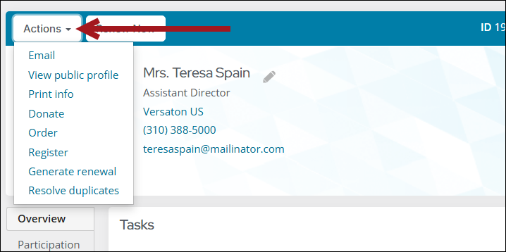
In this example, we will set up the Big Button Panel on the account page, so that staff can select a contact from the Directory, then quickly run a report, register for an event, make a donation, or order a product for that contact.
- Edit the account page that displays after a staff user selects a contact from your directory. In the Member site, it is the Account Page Staff content record.
- Add the Big Button Panel (Add content > ContentTypes > Content > Big Button Panel) content item to the content record and configure it with the following settings:
- Mode: Actions
- Display as: Dropdown button
- Dropdown button text: Actions
- Add an action link to run a report:
- Link Text: Print Info
- Link Target: Enter a link to a page that contains the SSRS Report content item that displays a report such as $/Samples/ReportingServices/Subreports/Member Profile Query.
- URL Parameter: ContactKey=@SelectedUser
Note: The SSRS Report content item must be configured to Hide the parameters section and to enable the option to Inspect query string for parameters. Do not enable the option to Inspect Session for parameters. For more information about SSRS reports, see Creating SSRS Reports.
- Add an action link for event registrations:
- Link Text: Register for an event
- Link Target: Enter a link to the event page
- URL Parameter: EventKey=<XYZ> (replace <XYZ> with an event code) EventKey=<XYZ> (replace <XYZ> with an event key), or use EventKey=@url:EventKey to use the event key from the URL parameter on the current page.
- Use On Behalf Of: Enable
Note: Customize this text for the event you want to register the contact for. For example, Register for the Spring Conference.
- Add an action link for donations:
- Link Text: Make a donation
- Link Target: Enter a link to your donation page
- URL Parameter: (Leave blank)
- Use On Behalf Of: Enable
- Add an action link for the shop:
- Link Text: Purchase a product
- Link Target: Enter a link to your Shop page
- URL Parameter: (Leave blank)
- Use On Behalf Of: Enable
- Save and Publish the account page.