Last updated on: April 23, 2026
Austin_Responsive, Toronto_Responsive, and London_Responsive are the first responsive themes available in iMIS. Websites that use these themes, such as the Member Responsive site, are responsive by default: the layout and appearance change based on the size of the device used to visit the site, so that the website looks good and is usable on any screen size.
The content in this section only applies to websites using a responsive theme in iMIS, whether it is the out-of-the-box Austin_Responsive, Toronto_Responsive or London_Responsive theme, a modified copy of them, or an original theme you have created to be responsive.
The topics that follow cover some general Responsive Web Design concepts and describe the elements in iMIS that are responsive or can be configured to be responsive as needed, including:
- Responsive layouts – iMIS content layouts define a grid structure for the body of a web page. They determine how many rows or columns each page will have. A responsive layout adjusts that structure fluidly based on the size of the device or browser used to visit the site.
- Responsive content – Many content items in iMIS respond to screen sizes automatically. You can also configure content items and HTML content to show or hide content based on the size of the device or browser used to access the content.
- Responsive navigation – The navigation is responsive. This includes elements like the primary, auxiliary, and secondary navigation.
Note: The following features are not available on mobile sites: Easy Edit, RiSE, Reports
In This Article
- Responsive Web Design concepts
What does Responsive Web Design respond to?
Does RWD affect accessibility?
Responsive content
Responsive layouts
Responsive navigation
Responsive Web Design concepts
Responsive Web Design (RWD) is an approach for creating websites that provide an optimal viewing experience — easy reading and navigation with a minimum of resizing, panning, and scrolling across a wide range of devices, from mobile phones and tablets to desktop computer monitors.
Creating websites specific to the physical limitations of a variety of devices — different hardware, with different screen sizes, with different resolutions — causes increased maintenance.
A site designed with RWD adapts the layout to the viewing environment by using fluid, proportion-based grids, flexible images, and CSS3 media queries.
The fluid grid concept calls for page-element sizing to be in relative units, such as percentages, rather than absolute units, such as pixels or points.
Flexible images are also sized in relative units, to prevent them from displaying outside their containing element.
In iMIS RWD sites, we use media queries to apply different CSS styles based on the dimensions of the device the site is being displayed on.
For more detailed information about the concept of Responsive Web Design, see http://alistapart.com/article/responsive-web-design by Ethan Marcotte.
What does Responsive Web Design respond to?
New devices with new screen sizes are being developed every day, and each of these devices might handle variations in size, functionality and even color. Many new devices are able to switch from portrait to landscape at the user’s discretion.
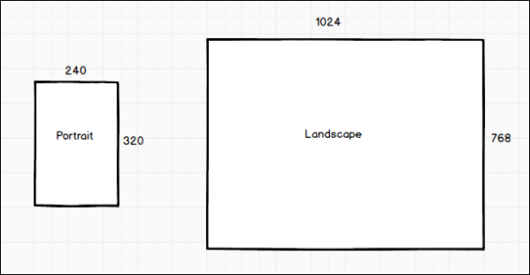
In addition to both landscape and portrait orientations, consider the hundreds of different screen sizes.
RWD sites respond to both the size and orientation of the device used to access the website.
Does RWD affect accessibility?
A responsive site does not automatically meet accessibility guidelines just because it is responsive.
But responsive Web design and accessibility are ways of making a site flexible. When designing a responsive Web page, Web designers begin by thinking about Web pages as a collection of elements that can be rearranged. When designing a Web page to meet accessibility requirements, Web designers begin by thinking about different ways a user might interact with a Web site.
Regardless of how responsive a web site is, if the data and content you are trying to convey to the user are not thought out and planned correctly, you can still have accessibility issues. Responsive design is about content and interaction, about look and feel, regardless of the device on which the content is being accessed.
Responsive content
Users can configure any of their websites that use a responsive theme to selectively show or hide various content based on the screen size of the browser or device used to visit the site. For example, an organization might want to have two versions of the About Us content: a longer About Us description when a user is visiting the site using a large or medium-sized screen, and a shorter description when the user is visiting using a smaller screen, for example, on a mobile device. On the Directory page, an organization might want to show more detailed results on larger screens, and less detailed results, with a smaller number of columns, on smaller screens.
iMIS provides two ways to accomplish this:
- Many dynamic content items include a configuration option that allows you to show or hide the content item on different screen sizes.
- iMIS also provides four utility classes that you can use within any dynamic content item that supports HTML editing.
When designing content for your responsive website, we suggest making your pages as small as possible. The goal is to create pages that work well on all device sizes. However, when needed, you can use these options and classes to hide content on particular screen sizes if something does not work with the overall design. Be careful when using these options, however: they only hide content. These options do not prevent content from being downloaded. This means that even though you can configure a page to look simplified on small devices, the page size can still be fairly large, which could lead to slower performance. You should only use these options to improve the UI design when needed, not to minimize page size.
Configuring display options in content items
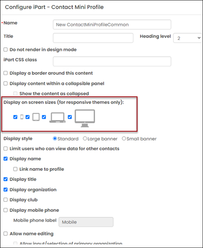
You can select how dynamic content items are displayed on various devices. Many content items provide a configuration option where you can choose how your content items are displayed.
Select one of the following display options:
- Extra-small screens – When disabled, this content item is hidden on extra small devices, such as smartphones, where the width of the screen is less than 768px.
- Small screens – When disabled, this content item is hidden on small devices, such as tablets, where the width of the screen is greater than 768px and less than 991px.
- Medium screens – When disabled, this content item is hidden on medium devices, such as laptops, where the width of the screen is greater than 992px and less than 1199px.
- Large screens – When disabled, this content item is hidden on large devices, such as wide computer monitors, where the width of the screen is greater than or equal to 1200px.
Note: When Easy Edit is enabled, all content items for a page are displayed, regardless of the Display on screen sizes (for responsive themes only) options that are selected.
For example, you might want to make a contact profile page that displays less information on smaller devices. You can accomplish that by using two Contact Mini Profile content items and the screen display configuration options. Add two Contact Mini Profile content items to a page on the Member site. Configure the first content item to only display the user's name, title, organization, and profile picture, then enable it to be shown on all screen sizes.
Now add a second Contact Mini Profile content item on that same page. This time, configure the content item to not display the contact's name, title, organization, and picture, but enable it to display all of the other Mini Profile options, such as displaying the user's address, join date, and paid through date. Only enable this content item to display on medium and large screen sizes.
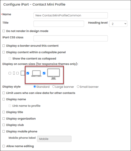
After adding this page to your responsive website, users that visit the page using large or medium sized screens, such as like desktop monitors or laptops, will see a longer version of the Mini Profile. Users that visit the page using extra-small or small sized screens (like mobile devices or tablets) will see a shorter version of the profile, because the second Mini Profile that contains the more detailed information will be hidden.
Applying display utility classes in HTML
iMIS provides four utility classes that you can use within any dynamic content item that supports HTML editing or within any content record zone (using the Zone CSS class), so that you can have granular control over the content that is shown on various screen sizes.
Note: These classes only work when applied to block-level elements. Use with inline and table elements is currently not supported.
- hidden-xs – When applied to any page element, the contents are hidden on extra small devices, such as smartphones, where the width of the screen is less than 768px.
- hidden-sm – When applied to any page element, the contents are hidden on small devices, such as tablets, where the width of the screen is greater than 768px and less than 991px.
- hidden-md – When applied to any page element, the contents are hidden on medium devices, such as laptops, where the width of the screen is greater than 992px and less than 1199px.
- hidden-lg – When applied to any page element, the contents are hidden on large devices, such as wide computer monitors, where the width of the screen is greater than or equal to 1200px.
 Click to view table
|
Classes |
Extra Small Devices: |
Small Devices: |
Medium Devices: |
Large Devices: |
|---|---|---|---|---|
| hidden-xs |
Hidden |
Visible |
Visible |
Visible |
| hidden-sm |
Visible |
Hidden |
Visible |
Visible |
| hidden-md |
Visible |
Visible |
Hidden |
Visible |
| hidden-lg |
Visible |
Visible |
Visible |
Hidden |
To configure your responsive website to selectively show or hide various content based on the screen size of the device used to visit the site, open the content item and select the <>HTML tab. This allows you to directly edit the HTML content. For any content that you want to hide on a particular screen size, apply the appropriate class to either a specific tag or to a div tag surrounding a group of elements you want to hide.
For example, consider a page like the following:
<h1>Our Association</h1>

<p>We are the leading association for the industry. We help professionals develop
their skills and further their careers by providing access to unique and relevant content
and exclusive member services. We provide continuity and support, guidance and
leadership development opportunities to over 200 local and regional chapters.</p>

<p>Our independent non-profit association was created to provide leadership for
the development, promotion, and improvement of our profession. Our strategic plan
calls for continued work in the areas of advocacy, diversity, education, and
organizational excellence.</p>
If a user wants to hide the second paragraph on extra-small devices, apply the hidden-xs class to the paragraph:
<p class="hidden-xs">Our independent non-profit association was created to provide
leadership for the development, promotion, and improvement of our profession. Our strategic
plan calls for continued work in the areas of advocacy, diversity, education, and organizational
excellence.</p>
When displayed in a browser, that paragraph will display on all screen sizes, except for extra-small screens, such as smartphones.
Responsive layouts
iMIS content layouts define a grid structure for the body of a web page. They determine how many rows or columns each page will have. A responsive layout adjusts that structure fluidly in response to the size of the browser or device used to visit the site.
The out-of-the-box content layouts available in iMIS are based on the Bootstrap grid system. These work in any website, but when used within an iMIS theme specifically created to be responsive, such as Austin_Responsive, then you can take full advantage of this fluid, percentage-based grid system.
There are three parts to the content layout grid:
- A container (defined in the master page)
- Any number of rows within the container
- Up to twelve columns per row
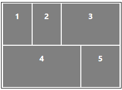
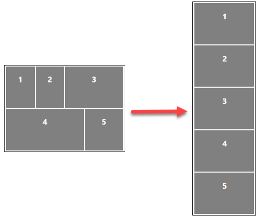
Each numbered section is a column. Columns 1, 2, and 3 are in one row, and columns 4 and 5 are in the second row. Each numbered section can contain different types of content, whether it is a content item or HTML content.
When you resize a page that contains a responsive layout:
- The width of each column adjusts proportionally to the rest of the page and expands or contracts accordingly.
- When the page is resized to a width less than 768px (or if you visit the site using a device that has a width smaller than 768px), then each of the columns collapse into a single column as shown below.
The best part of this system is that it just works. You do not need to do anything special to use responsive layouts in your website. When you create a new piece of content and select any of the out-of-the-box layouts, the layout will automatically have everything you need for your content to be responsive. You can also create new layouts if needed. For more information, see Creating custom layouts.
Responsive navigation
iMIS has three levels of responsive navigation in responsive-themed websites. The list below describes the out-of-the-box behavior of navigation in the Austin_Responsive theme.
- Primary navigation – On larger screens and devices, the primary navigation displays along the top of the page. But when resized below 768px, the primary navigation is hidden within a toggle on your website which remains hidden until the toggle is clicked.
- Sub-navigation – If any of the primary navigation items have sub-navigation, then these items are displayed on the page in two ways:
- When you hover over the primary navigation item and
- On the page itself (most useful for touchscreen devices, some of which do not support hovering). In the Austin_Responsive theme, the sub-navigation moves from the right column on larger displays to the bottom of the page on displays smaller than 768px wide.
- Auxiliary navigation – On larger screens and devices, the auxiliary navigation displays at the very top of the page. When resized to a width less than 768px, navigation icons are displayed in place of the text.
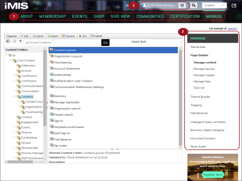
The following image demonstrates the navigation areas in the Austin_Responsive theme on a wider screen size.
Click to view image
- (1) Primary navigation
- (2) Sub-navigation
- (3) Auxiliary navigation
Responsive navigation utility classes
If you want to implement your own auxiliary navigation items in your site that mimic the style of the out-of-the-box auxiliary navigation items provided in the Member Responsive site, you can use the following utility classes. To use these classes, enter the value in the CSS Class field when defining the navigation item in Manage sitemaps.
- The class nav-aux-account adds a Person icon to the left of the navigation item in the auxiliary menu.
- The class nav-aux-cart will add a Cart icon to the left of the navigation item. This class displays the quantity of items in the cart above the cart icon when the user has any items in their cart.
- The class nav-aux-button, when added to either of these classes, changes the link to a button when the screen has a small width. For example, in the account link navigation item, enter nav-aux-account nav-aux-button. This will create an account button.
- The class nav-aux-primary-switch moves a navigation item from the auxiliary navigation area to the primary navigation area when the screen size is less than 768px wide. To use this class, configure your navigation item to not be hidden, and to display in the auxiliary navigation area.