Last updated on: January 27, 2026
Note: The following information requires a Forms - Premium license. For more information, contact your AiSP or ASI Technical Support.
Form designer defaults to drag-and-drop mode and is designed to allow you to create intuitive and responsive-ready forms.

In This Article
- Form elements
Using the Text & graphics options
Using drag-and-drop to create a form
Converting a drag-and-drop form to an Advanced form
Form elements
Note: For more information about the configuration options for each property, see Understanding the form elements.
The following sources are available for use in Drag-and-Drop mode:
- Text & graphics - Text and graphics fields consist of the Header and Text area elements. You may add as many headers and text areas as needed.
- Contact fields - Use data from the contact business objects within iMIS. These fields include both system values and editable fields such as First Name or Mobile Phone.
- Address fields - Contain all address fields defined in iMIS, such as Email and Phone Number.
- Activity fields - Flexible data sources that record various types of customer activities in the database. See Using activity fields.
- Single-instance - Allows you to define and configure a Single-instance Layout as a Form Part using your user-defined data within iMIS.
- Multi-instance - Allows you to define and configure a Multi-instance Layout as a Form Part.The Update field list button from the Edit Multi Layouts window will sync any changes in panel sources to your Multi-Instance layouts.
- Multi layouts - Allows you to embed a dynamic grid into your form. This allows users to update selected records within the context of a form submission. See Using multi-layouts.
- Actions - Allows you to add and configure buttons on your form to allow users to take specific actions, such as Submit, Save, and Cancel.
- Signup fields - Contains specific Form elements that must be used when creating new iMIS accounts using Form Builder.
- Documents - When creating a form for signup, documents are an important part of form submissions and are handled differently than other Form Elements. Documents are setup in Panel Designer as File Upload field types, which are not visible to unauthenticated users.
- Misc - The Misc field contains other Form elements that do not fit into the categories noted above. Currently, this field only includes the Captcha feature.
Using the Text & graphics options
For the Text & graphics drop-down, you can customize the form header and text areas to your specifications. You can add as many headers and text fields as you need.
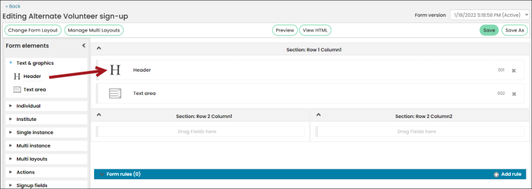
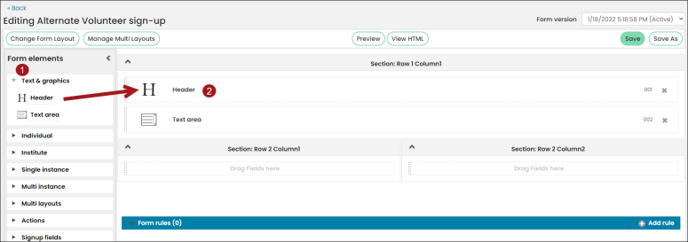
- Under Text & graphics, click and drag the Header element to the canvas.
- Click the Header element in the canvas to open its settings options.
- Under Heading level, choose which heading level you want. The default is Heading 1.
- Type your title into the text box below.
- Click Save.
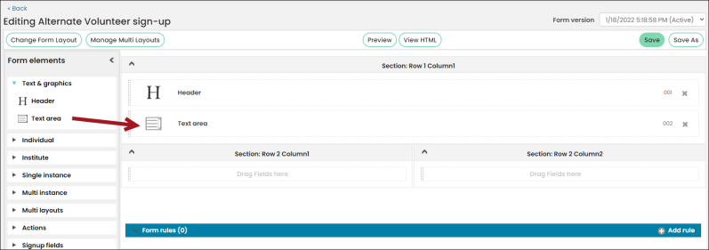
- Under Text & graphics, click and drag the Text area element to the canvas.
- Click the Text area element in the canvas to open its settings options.
- Use the formatting options at the top to create your content for the form, including using CSS if desired.
- Click Save.

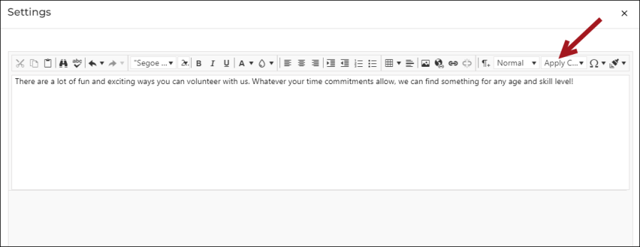
Note: Keep in mind that when working with CSS in the Text editor, you must either select the CSS Class to apply before entering the text or select the text to which you want the class applied and then select the class to avoid potential errors.
Using drag-and-drop to create a form
Do the following to use the Drag-and-drop mode to create a form:
- Go to RiSE > Form Builder > Form library.
- From the Form library, click Add new form.
- Fill out the general information about the form:
- Give the Form a Name and Description.
- Click the drop-down next to Form group to add the form to an existing tab that is located at the top of the Form library.
- Click Add. The drag-and-drop mode appears.
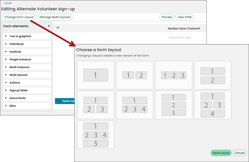
- Click Change Form Layout if you want to change the format. A blue check mark appears in the upper right corner on the selected format. Once chosen, click Save Layout.
- Do the following to create the form from the Form Elements selector. This tree structure allows you to pick from all available iMIS fields and components as well as form-specific elements such as text areas, buttons, and multi layouts.
- Click each Form element drop-down.
- Drag and drop each element onto the canvas.
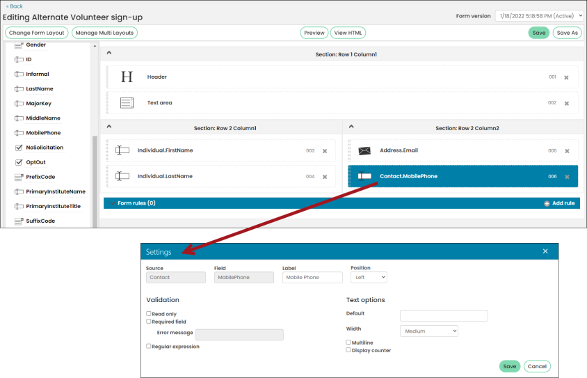
- Click each element to adjust its settings. See Understanding the form elements.
- Click Save to update the form version.

Warning! Unless one field is marked as Read only, do not add the same element to the form more than once to avoid saving errors upon submission. The two exceptions are headers and text areas found under the Text & Graphics form element categories.
Note: The Submit and Save buttons make changes to data, but only Submit invokes validation first. You can customize these options when creating a form.
Converting a drag-and-drop form to an Advanced form
One of the features of Form Builder is the ability to convert a drag-and-drop form to an advanced form. Any defied rules associated with the form are not converted.
Important! This conversion is irreversible; it is recommended to make a copy of the form first. Additionally, copying HTML from a Drag-and-Drop form and pasting into an Advanced form is not supported and may result in corrupted forms.
To convert a form, do the following:
- Go to RiSE > Form Builder > Form library.
- Click the edit icon of the form you wish to edit.
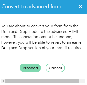
- Select Convert to advanced mode. A confirmation message displays.
- Click Proceed.
- The Advanced mode Form Designer displays. From here, edit the form as desired, and then click Save.

