Last updated on: January 27, 2026
Note: The following information requires a Forms - Premium license. For more information, contact your AiSP or ASI Technical Support.
Although the user interface is different, Drag-and-Drop and Advanced form fields share many of the same configuration options.
The form fields have specific configuration options depending on the type, such as single instance, panel source, contact, or actions. Review the following information to learn more about the form field configuration options.
In This Article
- General options & Validation
Text & graphics
Single and multi instance panel sources
Contact
Address
Activity
Multi layouts
Actions
Sign Up
Documents
Misc
General options & Validation

Many of the form fields have the following configuration options:
- Source:
- Drag-and-Drop: Details the element source.
- Advanced: Drop-down with available panel sources to choose from.
- Field:
- Drag-and-Drop: Details the element property.
- Advanced: Drop-down populated with properties depending on the selected Source. Depending on the Source and Field that you choose, you are provided different sets of attributes.
- Label – This text appears on the form as the field label. To hide a label, select No label from the Position drop-down.
- Position – This designates where on the form the label is located:
- No Label – Hides the field label.
- Left – Aligns the label to the left of the field. Left is the default position for all field labels.
- Top – Aligns the label above the field.
- Right – Only available for checkbox elements. Aligns the label to the right of the checkbox.
- Read only - When enabled, the formatting of the field changes from an entry box to plain text.
- Required field - Used to notify the user that the field is required. The default message is "Required field" but can be overridden to notify the user why a specific field may be required or to support alternative languages.
Note: Fields with Read only enabled do not display if the value is NULL or empty and instead display as an empty string.
Text & graphics
In Drag-and-Drop forms, the Text & graphics option offers options to add a header and text. You can add as many headers and text fields as you need.

In Advanced forms, the entire form-creation area is a text editor, so form users can easily add heading and text directly to the form editor.

Single and multi instance panel sources
In Drag-and-Drop mode, access panel sources from the Single instance and Multi instance form elements. In Advanced mode, access single instance and multi instance panel sources from the Panel Sources tab in the Source drop-down.
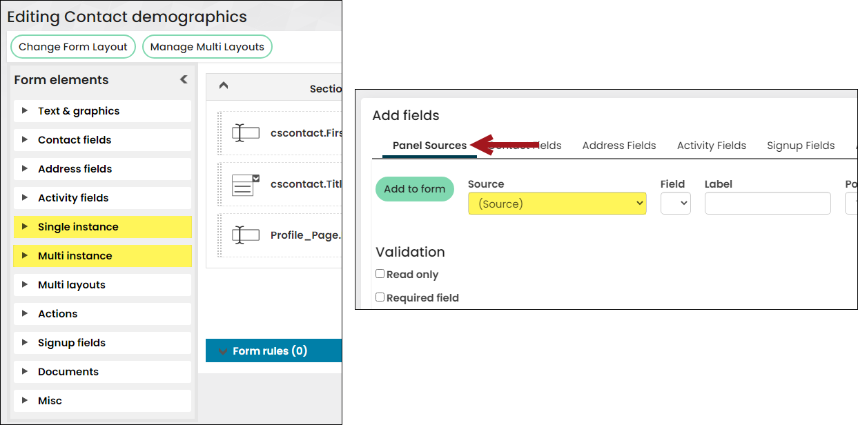
Form Builder offers the convenience and flexibility of deploying multi-instance panel sources within the context of a form.
Example: There is a multi-instance Education panel from which a contact can enter their education history, such as high school, under graduate, or post-graduate. The form requires the applicant to provide information on an applicant’s Highest level of education. Using the same multi-instance panel sources and properties, you can present the multi-instance fields in a form, so that an applicant can fill out their Highest level of education while also populating the Education panel.
The following table illustrates the available options for panel source properties (single and multi instance), with additional information regarding specific field options.
| iMIS Field Type | ||||||||||||
|---|---|---|---|---|---|---|---|---|---|---|---|---|
| Validation options | Currency | Date | DateTime | Decimal | Dropdown | Integer | Number | Text | Time | URL | Yes/No | |
| Read only | x | x | x | x | x | x | x | x | x | x | x | x |
| Required field | x | x | x | x | x | x | x | x | x | x | x | x |
| Regular expression | x | x | x | x | x | x | x | x | x | x | ||
| Textbox/Email/URL options | ||||||||||||
| Default value | x | x | x | |||||||||
| Width | x | x | x | |||||||||
| Multiline | x | x | x | |||||||||
| Height | x | x | x | |||||||||
| Display counter | x | x | x | |||||||||
| Currency/Decimal/Number/Integer options | ||||||||||||
| Default | x | x | x | x | ||||||||
| Minimum | x | x | x | x | ||||||||
| Maximum | x | x | x | x | ||||||||
| Drop-down options | ||||||||||||
| Lookup source | x | |||||||||||
| Free text search | x | |||||||||||
| Allow other | x | |||||||||||
| Add as text field | x | |||||||||||
| Sorting | x | |||||||||||
| Checkbox options | ||||||||||||
| Load as setting | x | |||||||||||
| Multi-instance options | ||||||||||||
| Load as | x | x | x | x | x | x | x | x | x | x | x | x |
| Save as | x | x | x | x | x | x | x | x | x | x | x | x |
Texbox
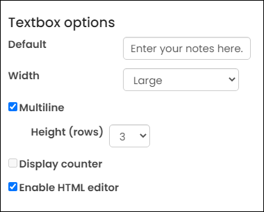
- Default – The default value can be set either as a text string or using a URL parameter. To use a text string simply add the text value that you would like to use. To use a URL parameter, append the token indicator “@ff@” in front of your parameter name. For example, if your URL contains the parameter ?Year=2020 then you would enter “@ff@Year” to pass the parameter value to the field. If the parameter is missing or empty then a blank value will be used.
- Width – Five options are available for field width ranging from extra small to extra large.
- Multi-line – Enable if the text field is to be displayed on more than one line.
- Height – Height in rows of a multiline textbox.
- Display counter – Adds a characters remaining counter to text fields to inform the user of the available space that they have to complete a text field. Generally used with large essay type fields.
- Enable HTML Editor - When enabled, the text field offers an HTML editor to the form user.
Note: If the form contains the CreatedByUserKey and/or UpdatedByUserKey properties, ensure the properties are set to Read only, since these fields are automatically populated by iMIS. If there are multiple forms using these properties, the properties must be set to Read only on all forms.

The following email options are available:
- Width - Select the width of the textbox where the email is entered. The options range from extra small to extra large.
- Display counter - When enabled, a characters remaining counter is added to the text field, so users know how many characters they have remaining to complete the email address. Generally not used for email addresses.
website/URL

The following options are available for websites:
- Default - the default website address.
- Width - Five options are available for field width ranging from extra small to extra large.
- Display counter - Adds a characters remaining counter to text fields to inform the user of the available space that they have to complete a text field. Generally used with large essay type fields.
Currency/Integer/Number (Decimal)

- Decimal places - (Number and Currency only) The number of decimal places that are used.
- Minimum – Minimum value that can be entered.
- Maximum – Maximum value that can be entered.
Note: Values entered for both the Userfield 4 and Userfield 5 will automatically save 4 decimals positions unless a smaller value is selected from the Decimal places drop-down from the Number options area.
Note: Numeric values are rounded if the number of decimal places entered exceeds the stored amount.
Drop-down options
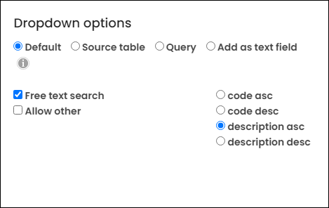
- Select one of the following lookup sources:
- Default - Uses the drop-down values defined in the source.
- Source table - Select a general lookup table to use as the drop-down list.
- Query - Select a query to use its results as the drop-down list. The query is required to contain one Display property with an Alias of Code and another with an Alias of Description.
- Add as text field - Changes the drop-down field to a text field. Select the Width size of the text box.
Example: One of the query sources is a contact business object, and the ID and Name properties are already added to the query. The ID property is updated to contain an Alias of Code, and the Name property is updated to contain an Alias of Description. After the query is updated, clear the iMIS cache (Settings > About iMIS).
- Free text search – Loads the drop-down options with a free-text search option. This allows users to type the first few letters of a field and have the available options quickly reduced to only those values that contain the letters in their search. For example, typing “Ha” in a university search would bring up “Harvard” and “Havergall”.
- Allow other - Enable to allow users to enter a value not offered in the drop-down list.
- The following sorting options are available:
- Code asc - Sorts the drop-down list alphabetically by code (a-z).
- Code desc - Sorts the drop-down list alphabetically by code in descending (z-a) order.
- Description asc - Sorts the drop-down list alphabetically by description (a-z).
- Description desc - Sorts the drop-down list alphabetically by description in descending order (z-a).
Multi-select options
The following multi-select options are available:
- Horizontal or Vertical - Determines how the data is displayed when there is more than one column defined:
- Horizontal - Values are displayed by code in ascending alphabetical order horizontally. Example:
- Vertical - Values are displayed by code in ascending alphabetical order vertically. Example:
- Columns - Define the number of columns to use to display the values.


Checkbox
The Load as option is available for checkboxes, with the following options:
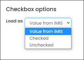
- Value from iMIS – Default setting, which displays the user-selected value.
- Checked – Overrides the user-selected value to always load as selected/checked. Useful for sign-up situations where certain options are recommended to the user.
- Unchecked – Overrides the user-selected value to always load as deselected/unchecked. Useful for confirmation statements.
DATE OPTIONS
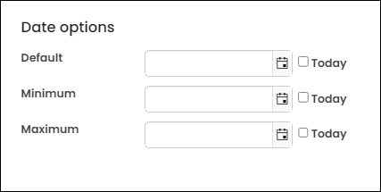
Date properties have the following configuration options:
- Default - The field is pre-populated by this date.
- Minimum - The earliest date a user can choose.
- Maximum - The latest date a user can choose.
To set a date, either manually select or enter a specific date, or enable Today to automatically default to the current date. When Today is enabled, the date input field is disabled, and @now is set as the value in both the form’s HTML and the date field.
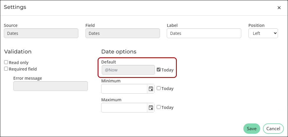
Note: If the form contains the CreatedOn and/or UpdatedOn properties, ensure the properties are set to Read only, since these fields are automatically populated by iMIS. If there are multiple forms using these properties, the properties must be set to Read only on all forms.
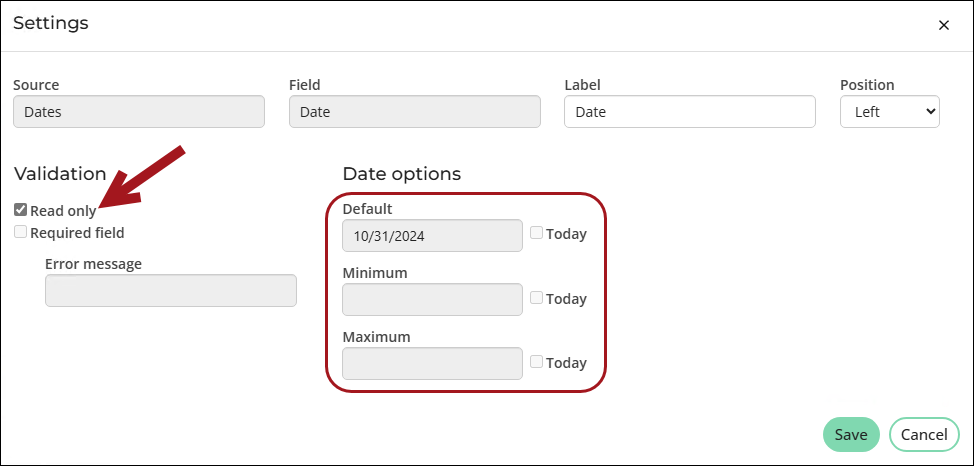
Note: If Read only is selected, all Date options fields are grayed out, displaying only existing values that cannot be edited.
Contact
Contact Fields are core fields provided by iMIS for an organization or individual account. Each contact field has specific attributes and options that are preconfigured within iMIS to provide the ability to deploy a comprehensive profile of common demographic information.
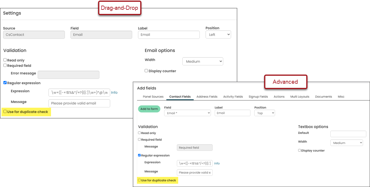
The Use for duplicate check checkbox is available on certain contact fields. When enabled, the field is used during duplicate checking. See Displaying a form for more information about duplicate checking.
Notes
- Sign-up forms require the Email property from the Contact Fields element. This source uses the CsContact.Email business object that is necessary in the account creation process.
- When changes are made to the underlying address, advanced flow down rules are applied as appropriate.
- The Member Type and Company Member Type properties in iMIS Forms are Read Only and cannot be changed.
- When designing forms for unauthenticated users to add new contacts without a user account, only include first name, last name, and email fields. If the account Signup fields are absent, any additional information entered, such as address details or panel source properties, will not be saved upon form submission.
- Duplicate prevention options only apply when the username and password fields are present. See Displaying a form for more information.
Address
The Address Fields element is directly linked to the Address purposes (Settings > Contacts > System options). Only the address purposes defined in the System options are available under the Address Fields form element. To offer users full access to editing their addresses, use the Contact Address Editor content item in addition to the form. Use forms to only expose specific addresses and fields for update and/or put them in the context of an overall submission.
Important! Sign-up forms require CsContact.Email (under Contact Fields) and not Address.Email.
To learn how to use preferred billing, mailing, and shipping address options in a form, see Offering preferring billing, mailing, and shipping options on a form.
The following table categorizes the supported address fields:
| Field | Type | Read only? | Format |
|---|---|---|---|
| Address1 | Character | ||
| Address2 | Character | ||
| Address3 | Character | ||
| AddressNumber | Integer | Yes | |
| BadAddress | Character | ||
| City | Character | ||
| Country | Character | Drop-down | |
| County | Character | Textbox | |
| Fax | Character | ||
| FullAddress | Character | Yes | |
| LastUpdated | Datetime | ||
| LastVerified | Datetime | Yes | |
| Phone | Character | ||
| PreferredBill | Radio button | ||
| PreferredMail | Radio button | ||
| PreferredShip | Radio button | ||
| StateHouse | Character | Dropdown | |
| StateProvince | Character | Dropdown | |
| StateSenate | Character | Dropdown | |
| UsCongress | Character | Dropdown | |
| Zip Character | Character |
Activity
See Understanding activity fields.
Multi layouts
See Understanding multi-layouts.
Actions
Actions are programmable buttons that allow you to drive the form submission process. Buttons can be used to:
- Drive navigation – Send the user to another page
- Submit updates – Update information
- Invoke processes – Run a designated process to perform database functions
These basic actions can be used in combination; for example, a single button can update data, run a procedure, and then send the user to a new page.
Appearance
Appearance options allow you to define and control how actions appear on your form:
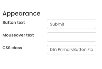
- Button Text - The label which describes the purpose of the button. The standard button style and formatting will be picked up from the RiSE template.
- Mouse over text – The button will be rendered with additional “alt” text which is displayed when the cursor is held over the button. This can provide additional information to your user about what the button does.
- CSS Class – By default, buttons have the standard class of ButtonText, which picks up the default button style defined for the website. Using this feature, you can override the class to:
- Change a button to a hyperlink
- Change the font or background color of the button
- Change the shape or size of the button
Important! Using periods in the Button Text field will cause the button to fail.
By changing a button’s characteristics, more or less attention can be brought to the button, as part of the design. For example, changing a Delete Record button to have a red background
Behavior
A form submission event occurs when the data entered on the form is securely transferred to iMIS and presented to the database for updates. If the updates are successful, the form will complete its processing by returning a message (success / fail) and/or transferring control to a new page.
Note: All fields must be placed above the Submit and Save buttons. Fields placed below the Submit and Save buttons will be ignored when the form is submitted.
The following types of submission options are available:
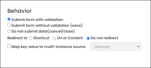
- Submit form with validation - Upon submission, all fields are validated on the form. When the fields are validated, the form is submitted.
- Submit form without validation (save) - Allows the user to submit partial information and is usually used for a Save my Work button on longer forms. All fields that can be saved are accepted and updated; however, fields which do not validate are ignored and no processes are run.
- Do not submit data (cancel/close) – This option is normally used with a Cancel or Close button to allow the user to back out of any changes before they are submitted.
- Open redirect link in new window - This option will force a supported browser to open a new window or tab upon a successful submit.
Note: The Submit and Save buttons make changes to the database, but only Submit invokes validation first. You can customize these options when creating a form.
If the Submit form with validation option is chosen, and the form submits without error, then the Action form part also defines:
- Redirect to - This is an optional value which defines where the form should send the user if the form submission is processed without error. The following options are available:
- Shortcut – Specify a valid shortcut from the drop-down.
- Url or Content – Specify a complete URL or select a content record from the content item browser.
- Do not redirect – Leaves the user on the form and displays the appropriate success or error message.
- Parameters – Parameters can be combined with any of the redirection options to provide information to the next page in a sequence about the iMIS records that have been created or updated. Parameters are defined with the format of: ParameterName1=Value1&ParameterName2=Value2
- where:
- “ParameterName” is the name of the parameter – for example ID, Year or Amount
- “Value” is one of:
- A specific value – YEAR=2021, Option=A, MEMBER=Yes
- A dynamic value from the form context – You can pass the newly created member ID to the next page using a parameter of "ID=@ff@ID". Only the ID property is supported for use in this dynamic format.
- A dynamic value from the page URL (flow through values) – used when you wish to preserve a URL value that may or may not be part of the overall form context
- Map key value to multi-instance source - When a key value (such as an ordinal or sequence) is used as a redirect parameter, this option allows you to define which multi-instance source will be used when passing or redirecting the selected value to the next page.
Note: If a form does not complete the submission process fully then the redirection is stopped and the error message(s) are displayed to the user so they can be resolved.
Post Processing
See Post processing with Forms.
Sign Up
Sign-up fields are special fields that are used only on Create Account forms:
- Username – Unique username for the new account
- Allow user to enter their own Username – Allows users create their own username for their account.
- Assign new iMIS ID as Username and hide field – The user is assigned an iMIS ID as the username, so the username field is hidden on the form. If this option is enabled, the Username field is automatically hidden on the form; however, it must still be added to the form.
- Assign Email as Username and hide field - The username for users must be a valid email address. The username field is hidden on the form. If this option is enabled, the Username field is automatically hidden on the form; however, it must still be added to the form.
- Password – Password for the new account
- Confirm Password (optional) – Special field that verifies that the password was entered correctly. This field is not saved in iMIS.
Create Account forms allow you to create a new account in the context of a form submission. The following are required for Create Account forms:
- Individual Accounts – In addition to the Username and Password fields, the form must include a First Name, Last Name, and Email. Use the Email property located in the Contact Fields (CsContact.Email).
- Organization Accounts – In addition to the Username and Password fields, the form must include the Company Name and Email.
Tip: To prevent signed-in users from submitting a Create Account form, ensure the content record that is used to display the form has the proper Access Settings configured. Without the proper Access Settings configured, a logged-in user can view and submit the form (none of their existing information will be visible), and a new account will be created.
Documents
Documents are an important part of form submissions and are handled differently from other Form Elements. Documents are setup in Panel Designer as File Upload field types, which are not visible to unauthenticated users. See Creating panel sources.
Note: File Upload fields are not available for forms with multi-instance layouts.
Validation
- Read only – When enabled, the document name is displayed (if available) with no option to remove and/or upload a new version.
- Required field – When enabled, the form will not be permitted to submit without a document having first been uploaded. The default message is Required field but this can be overridden to notify the form user why a specific document may be required or to support alternative languages. If a document is in the process of being uploaded, the form submission will be blocked and a message will be shown to the end user informing them to wait until the upload is finished.
Document options
- Document types – This displays the settings from Panel Designer which control the document types permitted for a specific field. These settings can only be changed by updating the property in Panel Designer.
- Max Size (MB) – This setting allows you to set a value that is less than the overall maximum value for a document field for the purposes of a given form. For example, while a document field may have a 10 MB maximum for general purposes you may wish to enforce a smaller value on a public-facing form.
- Allow removal – This setting allows the user to remove a document from the database immediately without waiting for the Submit button to be clicked.
Multi-instance options
- Load Blank, Save New (default) – Displays an empty field and saves to a new record by updating an entry in the underlying object or table.
- Load Blank, Save Last – Displays an empty field and overwrites the last entry in the underlying object or table. This option is not recommended as the record being overwritten is not visible.
- Load Last, Save Last – Displays the last entry and overwrites it.
- Load Last, Save New – Displays the last entry and saves to a new record by updating an entry in the underlying object or table.
- Load Where, Save Where –
- The Source is an available property in the underlying object or table.
- The textbox below contains the string value to be matched.
- If using a URL parameter, the value must be prefixed with "@ff@".
- The URL parameter's name must exactly match the string entered after the prefix.
- The URL value must be compatible with the data type of the Source property.
- The textbox below contains the string value to be matched.
- The only possible comparison operation is "equals" even if the property contains numeric data.
- The Where clause is not currently supported with Approvals.
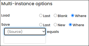
- The Source is an available property in the underlying object or table.
Misc
The miscellaneous group encompasses Form Elements that are not available in other areas. Presently this option includes the Captcha feature.